Sci-Fi Tactics HUD |
Last Updated: August 2017
|
I was recently inspired to make a UI for a sci-fi game. The elements in the UI include:
- Squad info (slightly scalable for multiple sized parties)
- Minimap and waypoints for units on your squad
- Shield for your selected unit
- Energy for your selected unit
- Weapon info including weapon name, current ammo, and max ammo
Research
During my research, I took inspiration from a couple different places including:
- Star Wars: Rogue One
- Oblivion (the movie)
- Endless Space 2
- Civilization: Beyond Earth


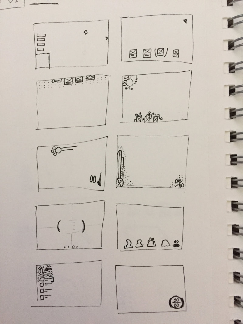
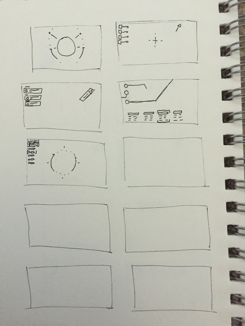
Low- Fidelity Wireframes
After doing research, I took to the classic pen and paper to draw some wireframes. I find this step to be easiest when drawing. This way, I don't get caught up on one idea. Some ideas that I tried include:
- Squad pictures on various positions of the screen.
- Waypoint information in one corner (top left) and lines drawn across the screen displaying the direction of event.
- Organic and structured shapes for icons/pictures.
- Dot backgrounds on specific parts of the screen.
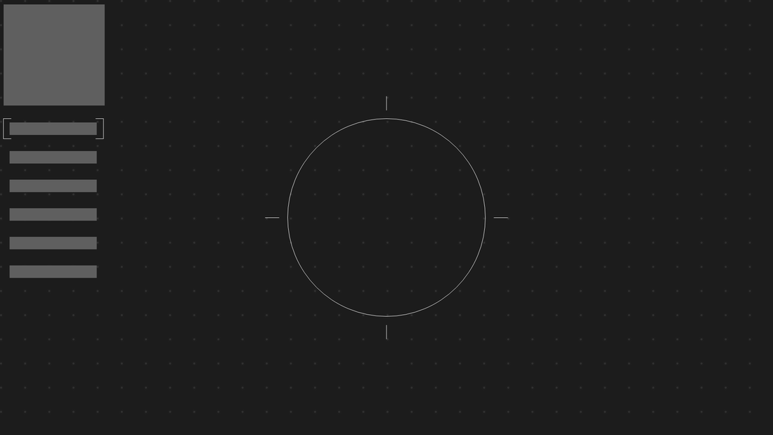
Greybox
After deciding on a wireframe I was comfortable with. I wanted to greybox the UI to make sure the size and locations were where I wanted them to be. Here's what I came up with.
I wanted to make sure the information on the right side was aligned properly and the minimap was a square. This would make it easier to position and reduce any awkward white space.
I wanted to make sure the information on the right side was aligned properly and the minimap was a square. This would make it easier to position and reduce any awkward white space.
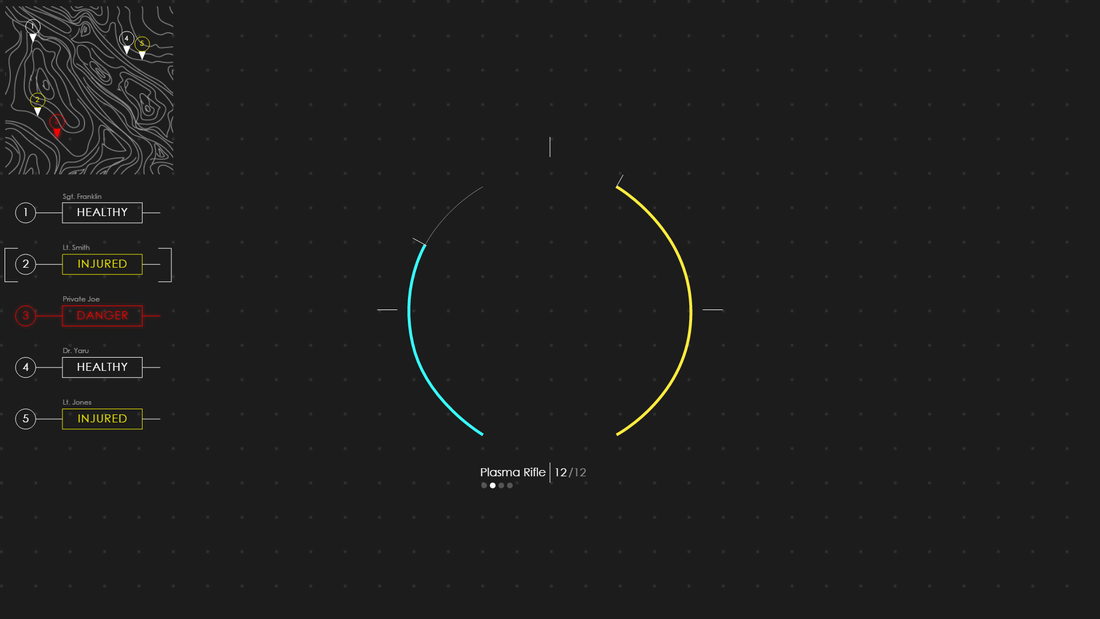
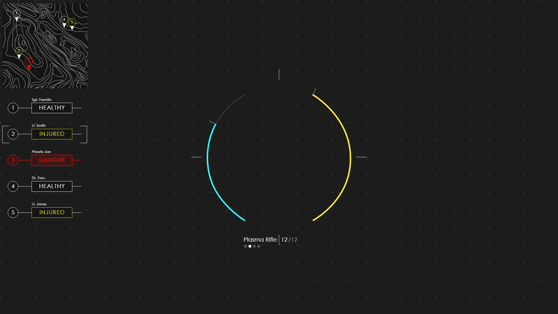
High-Fidelity Wireframe - Version 1
From there. I created the art to go into the wireframe to see an example of what the wireframe would look like without having to implement it into an engine. I came up with something like this. Some things to note are:
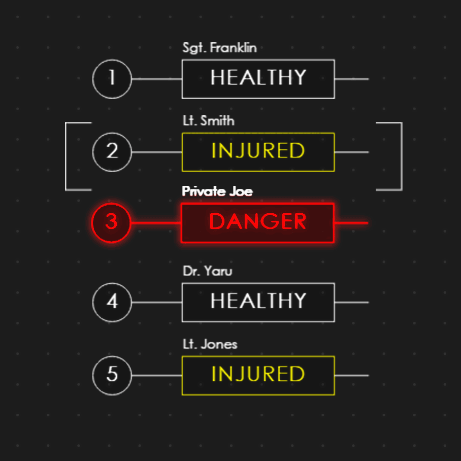
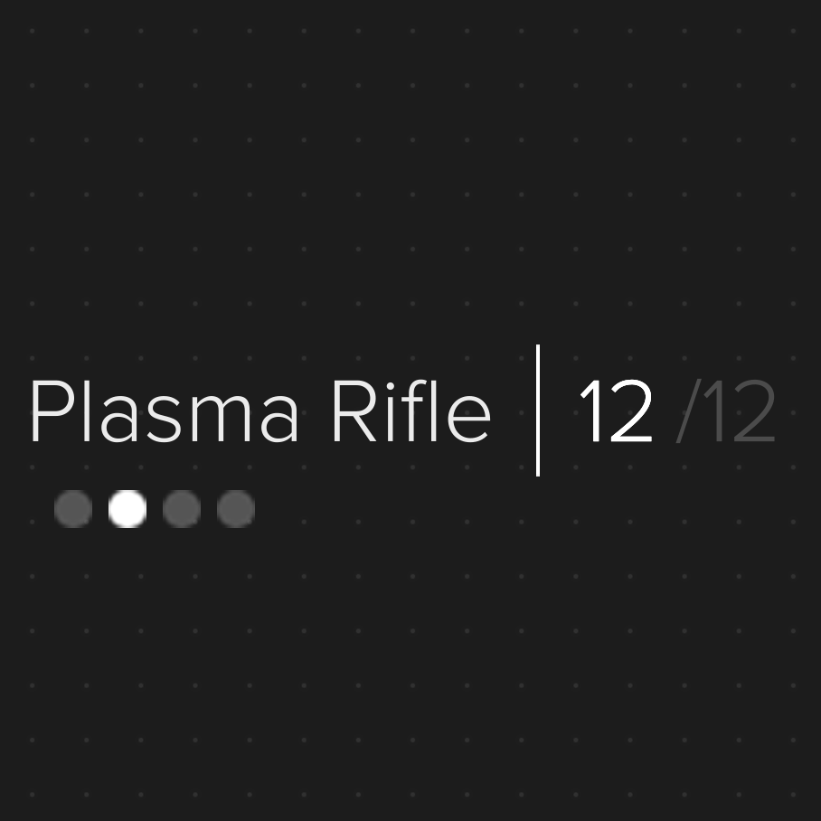
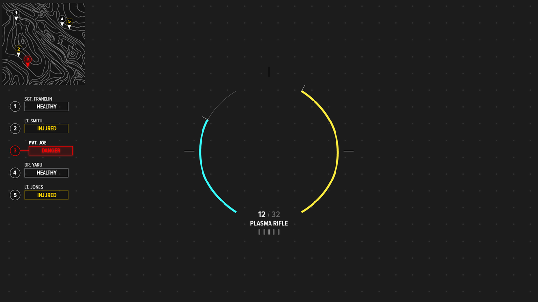
- The health/shields and energy are displayed on the center dial. The bars empty towards the bottom
- The font choice is Century Gothic. I went with a simple sans serif font with a large x-height and thin lines to make it more pleasing and easily readable.
- The yellow colors for injured and energy are different. I tried to get a slightly more orange yellow for injured to bring attention to that when glancing at your team status but not bring too much attention to it. In playtesting, I might change the yellow if it becomes too distracting.
- The person in danger has a slight glow to it. In the game, it might fade in and out or shake a little depending on how much attention is needed to be brought to that aspect.
- I chose the blue color for shield because I blue is a common color for shields. It also leaves room for red (a common color for health) to be used as a danger color. Anything red will immediately stand out as something that needs attention. I chose the yellow color for energy because I wanted energy to be an important resource to take note of but not as important as a crew member in danger. Also note that shield is the only color that is blue on the screen. This makes it stand out compared to the other colors.
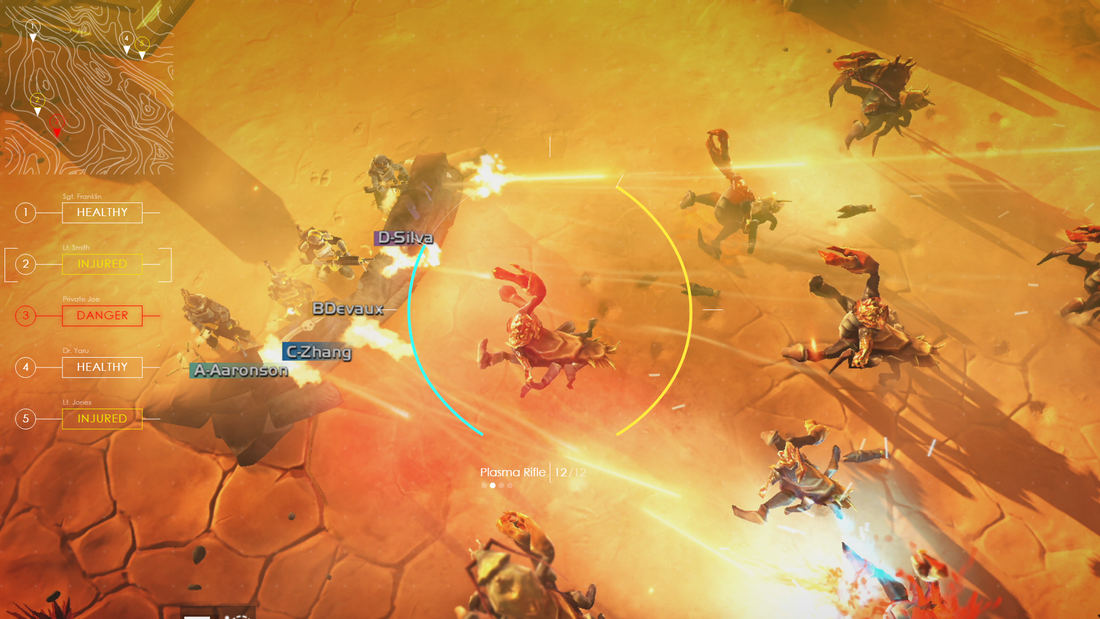
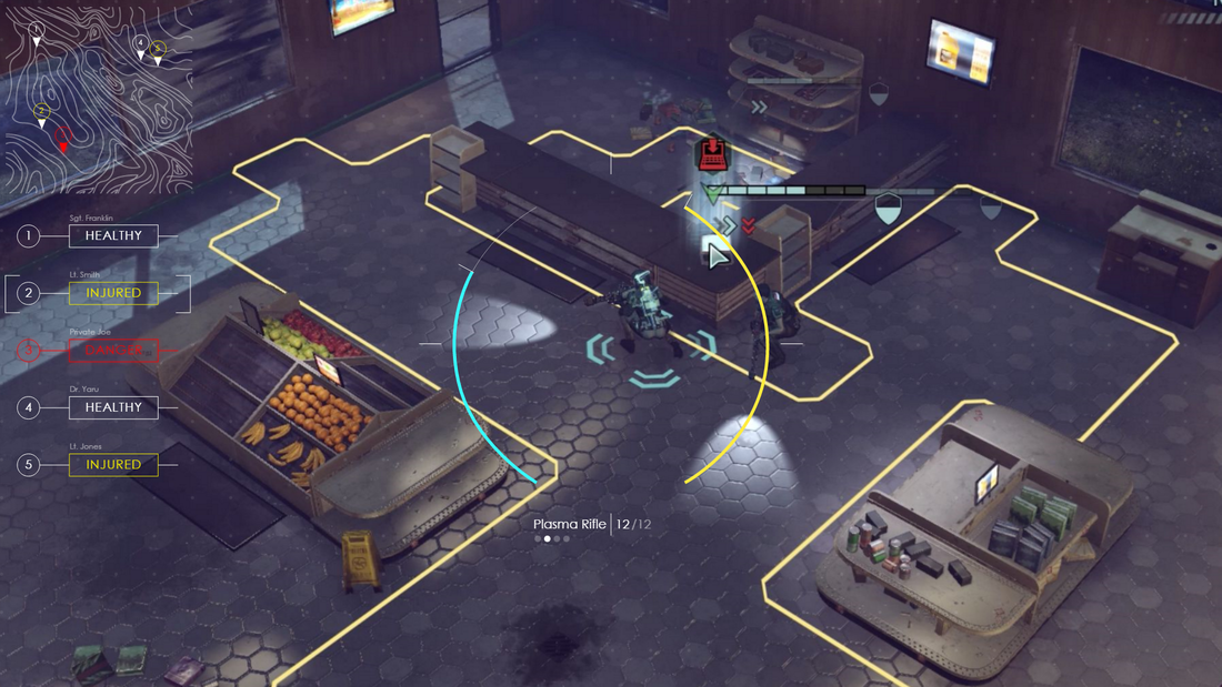
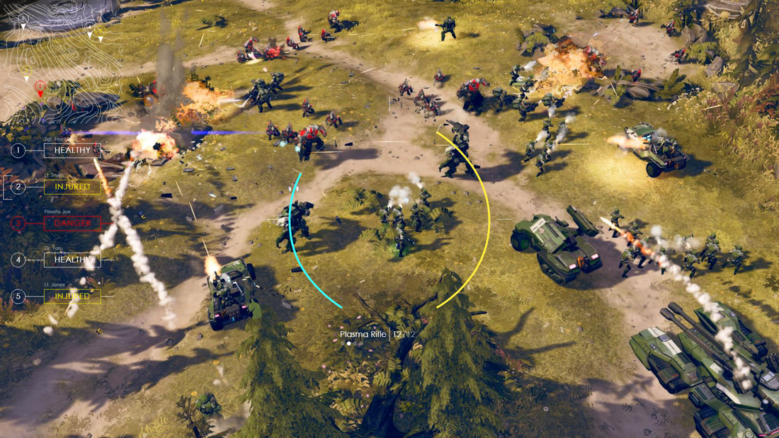
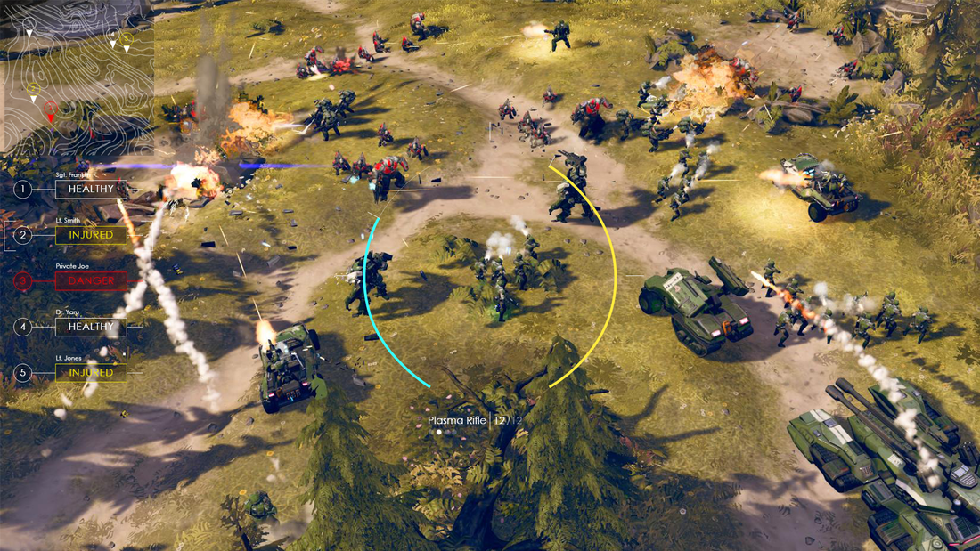
Background Test - Version 1
After mocking up the UI, I was concerned about the thin lines being lost to some busy screens or bright colors. So I pulled screenshots from Helldivers, Halo Wars 2, and XCOM to see if my UI would work with those color palettes.
High Fidelity - Version 2
I then went back to the High-Fidelity and edited it a little. Edits are as follows:
- Put a dark background behind the minimap in hopes of bring it out in busier environments.
- Made the Unit names opaque so they also don't get lost in busier environments.
- Put a fill in the statuses so that important information would be more visible.
- Edited the glow on the danger status so it would be brighter.
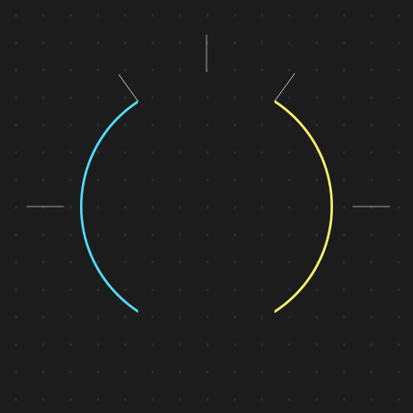
- I kept the blue and yellow of the center circle the same because I liked how they looked on the backgrounds. The colors stood out enough to bring attention to them when you need it but in the heat of battle would fade away into the background. This is an attribute of a good UI. Information available when the player looks, but hides away when they don't need it.
Background Test - Version 2
I took the UI and put it back into the background tester. I find the edits I made significantly improved the overall visibility of the UI. However, I do think it could be improved a little more. Design is never done!


Motion Design
I took the wireframe into Adobe AfterEffects and did a little bit of motion design. Some things to note:
- Any shaking or glowing is only on the X axis.
- Shield/Energy regeneration is smooth. Interruptions can happen during regeneration.
- Weapon swapping can only happen in 1 direction and loops. 4 weapons is the example but doesn't necessarily have to be 4 weapons.
High Fidelity - version 3
After spending some time away from the UI I went back to tighten up the overall look. Some things to note are:
- Removed the unneeded line on the squad status
- No more scrolling up and down then selecting squad members (hard to map with controller input)
- Made shield and energy bars 7px wide instead of 5px. I think this would bring them forward more and help distinguish them as important pieces of information
- Redid the weapon information in the center to accommodate weapons with longer names
- Tightened up the type by using Proxima Nova Condensed and adjusted the kerning
Other Info
- This UI was made using my own 2 hands in Adobe Experience Design (including the topographic map).
- I tried to make this UI as simple as possible. However, the elements required would be based on what mechanics are used in game so some might be added or removed.
- This UI is meant to be controlled with a gamepad.
- I really enjoyed working on this project so I might revisit it in the future. After I study up by watching some Star Wars!
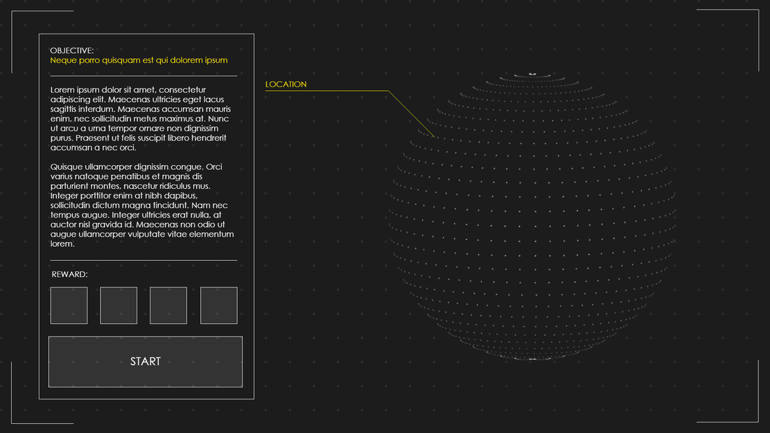
Bonus UI!
I was so excited about my HUD and inspired by my research that I wanted to make a mission briefing screen. The dot-sphere is very reminiscent of the Death Star plans from Star Wars. In the end, the lorem ipsum would be replaced with quest text and the location would change based on where it would be located on the planet.