Viking Inventory
Designer & Creator
July 2020
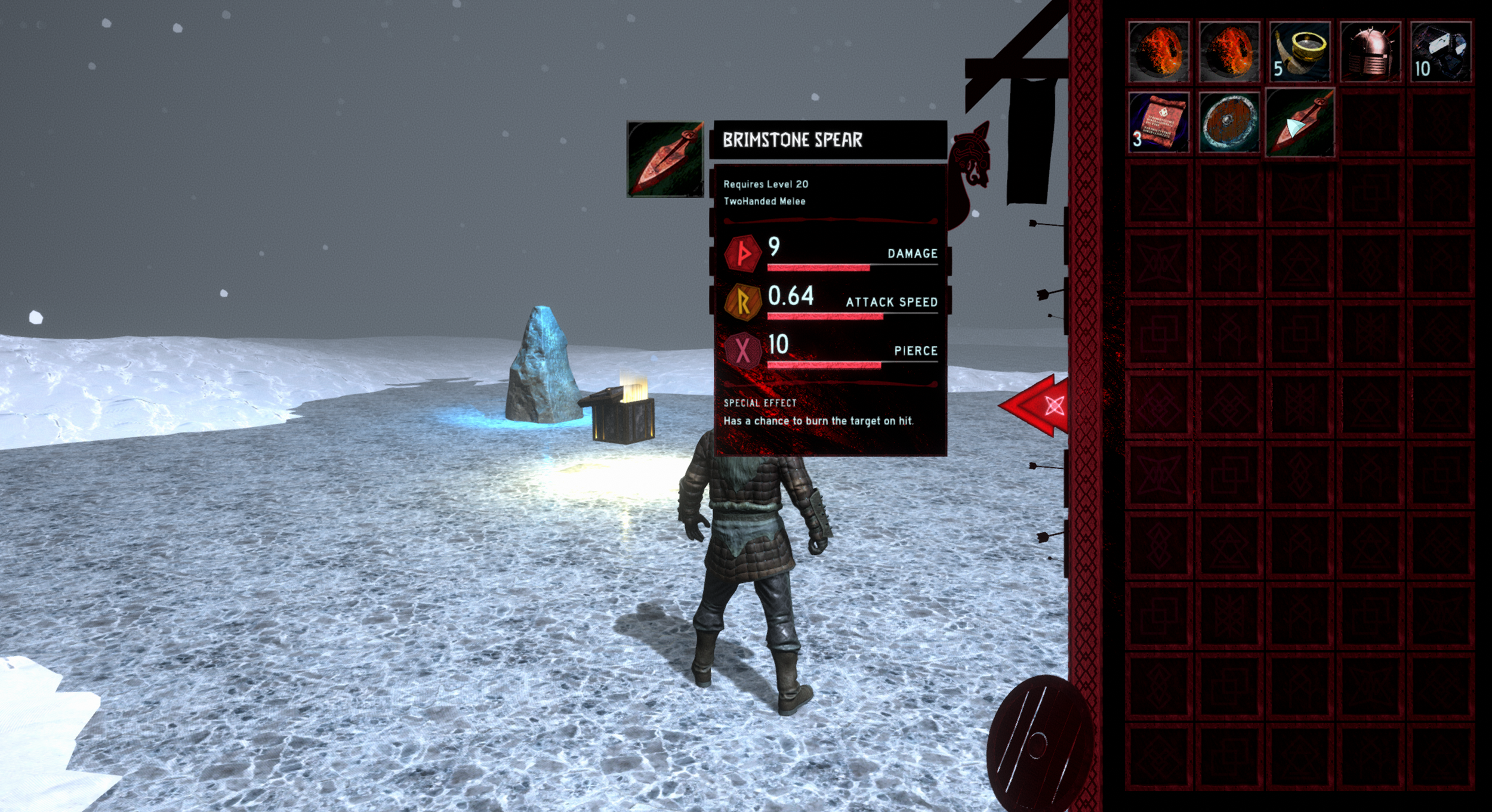
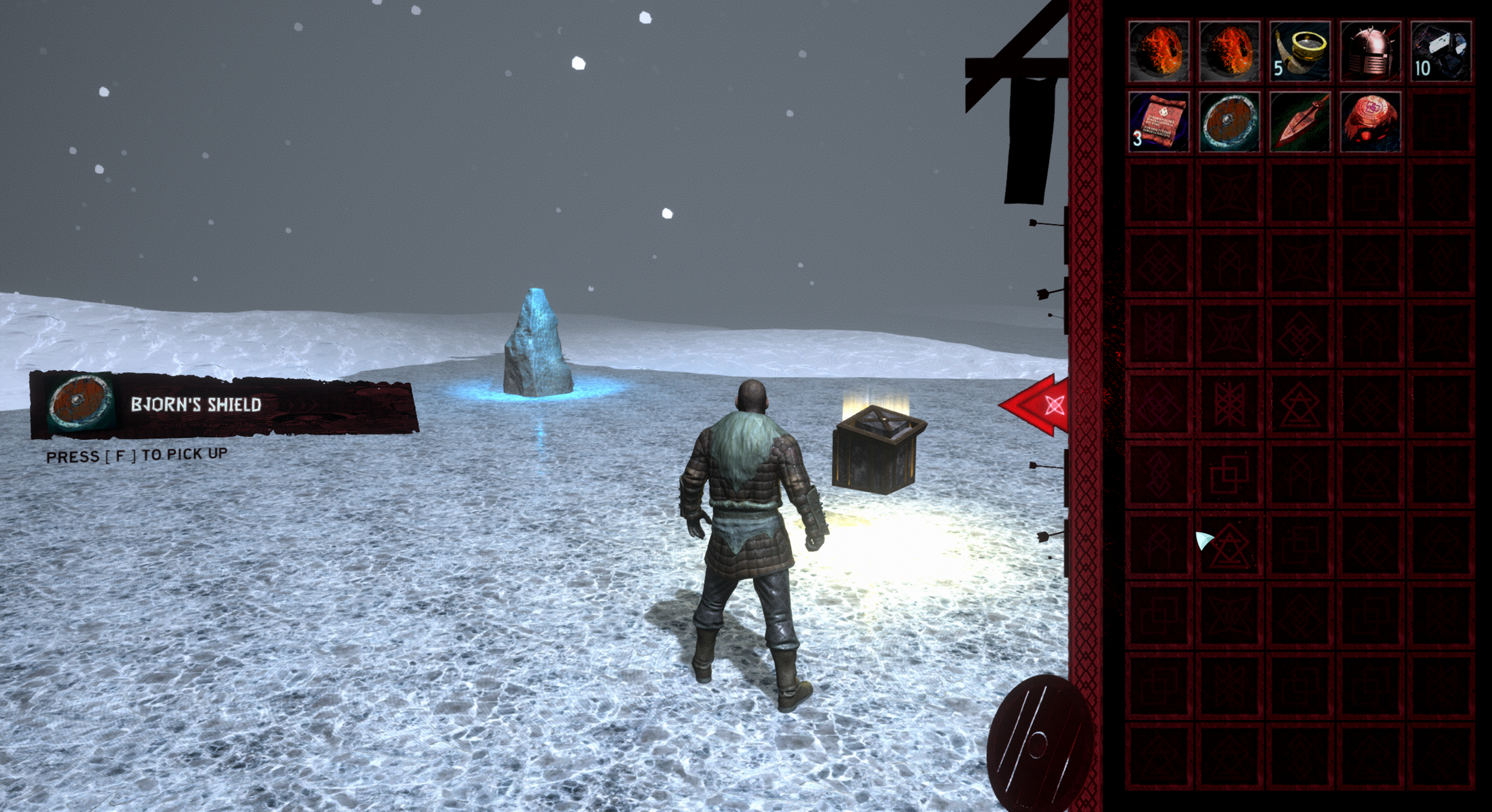
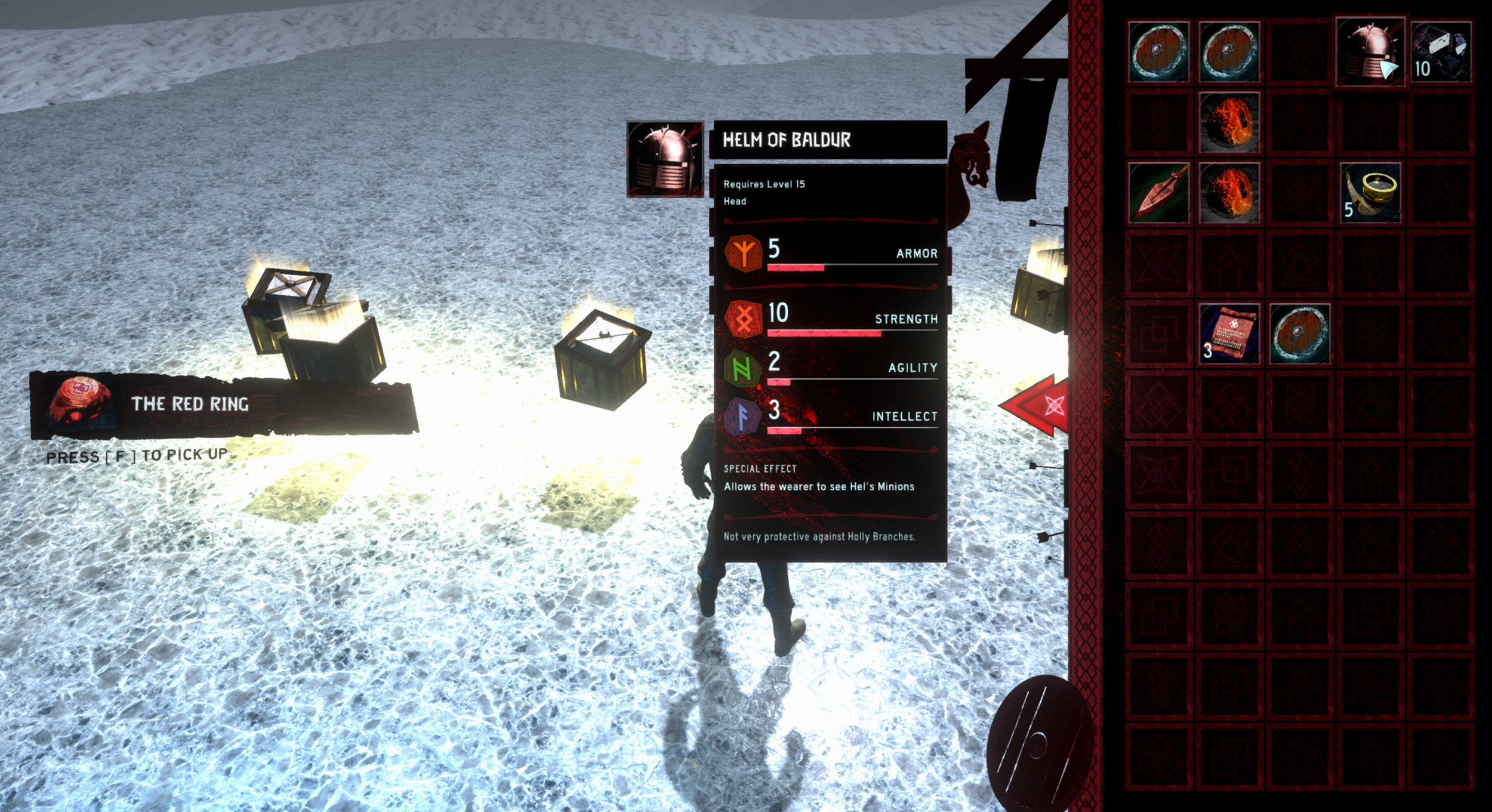
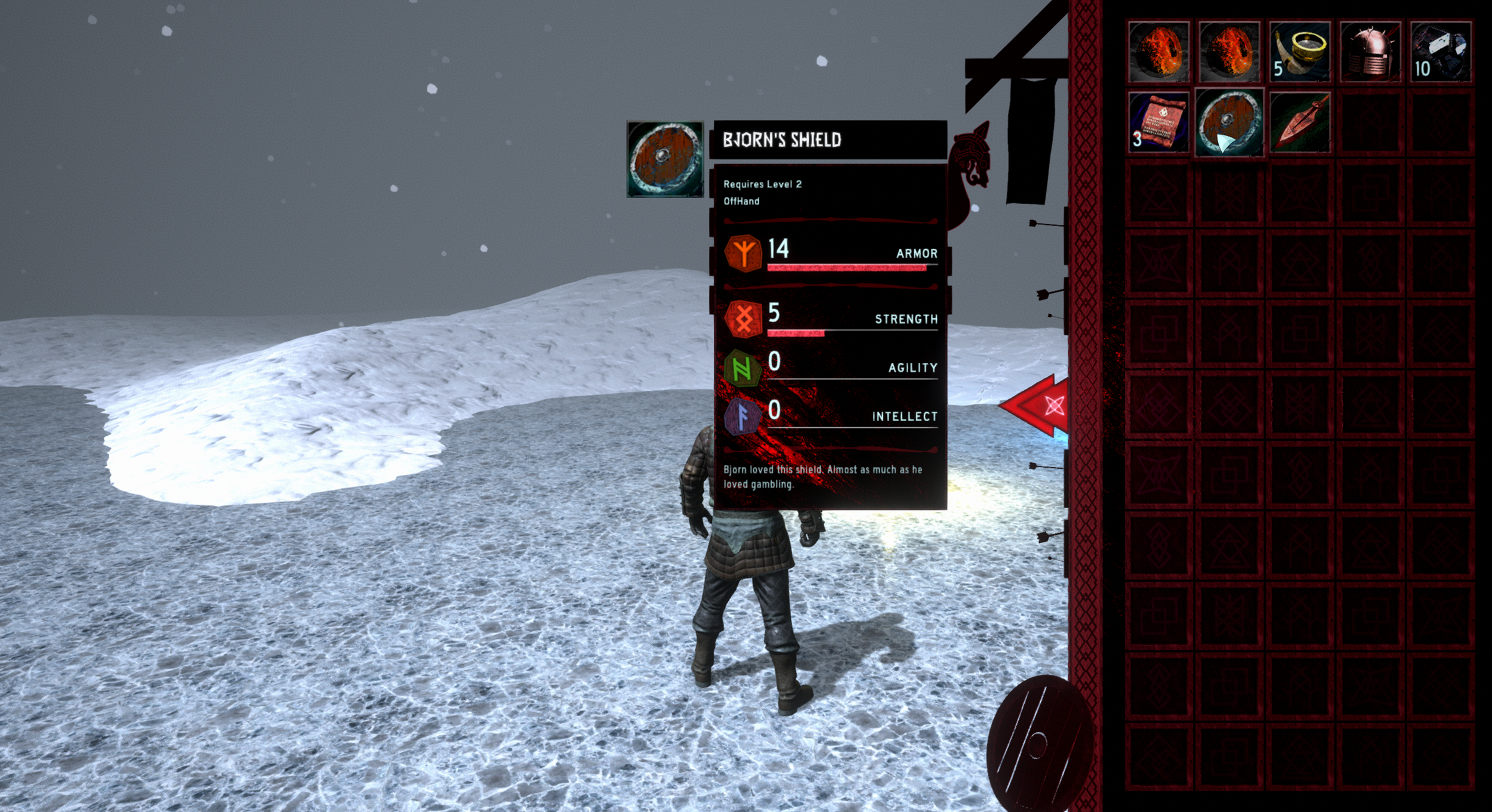
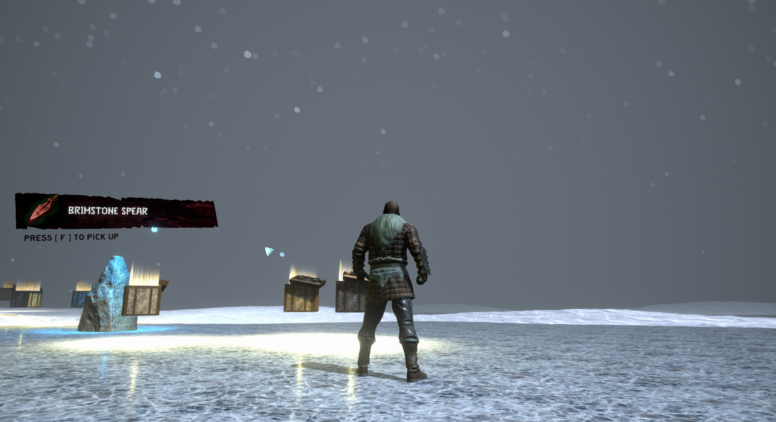
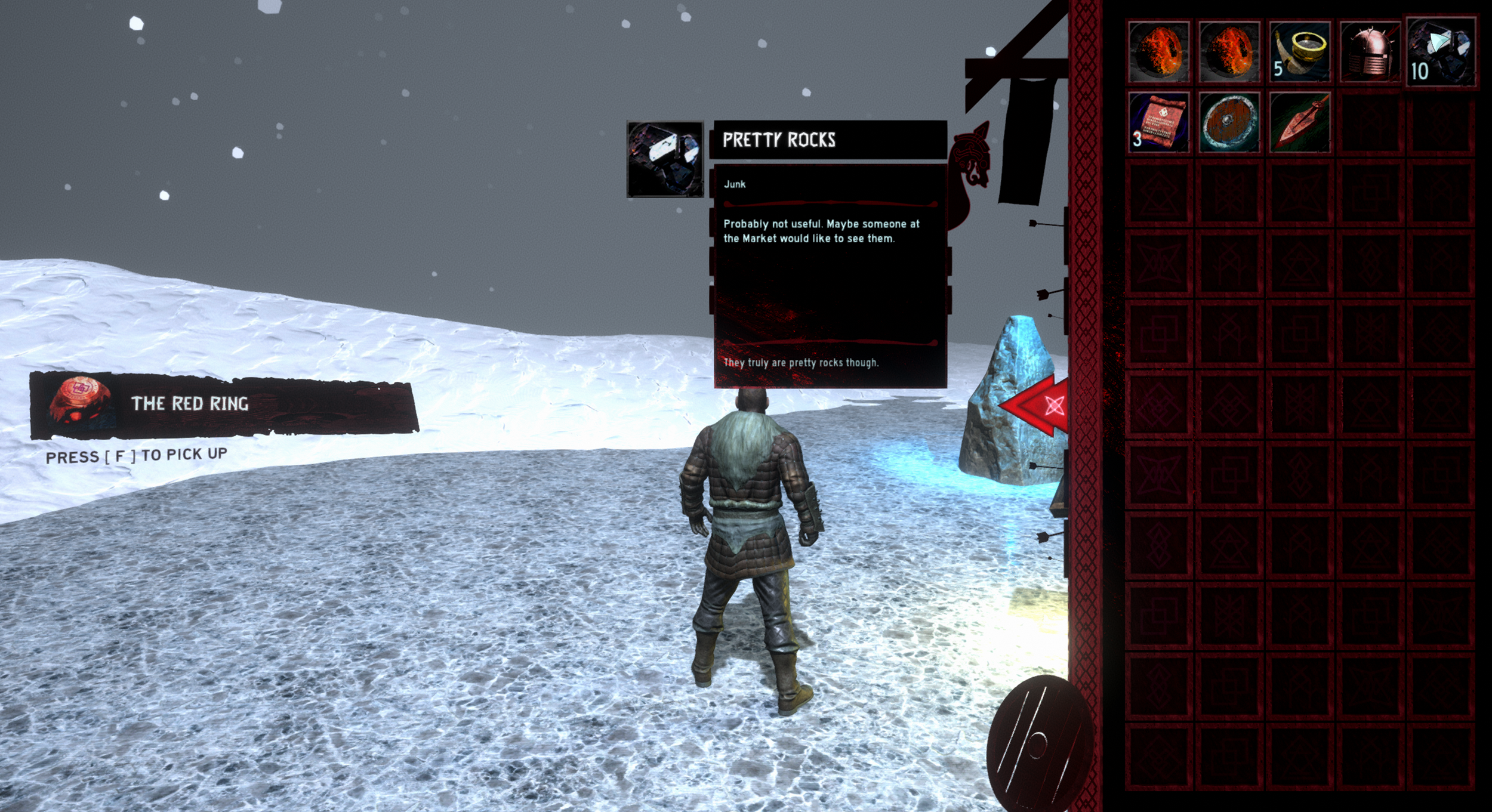
The Viking Inventory combines skeuomorphic UI design with my growing interest in 3D materials. I drew inspiration from Diablo’s atmosphere, Guild Wars 2’s iconography, and World of Warcraft’s grid-based inventory, then brought those influences into a Scandinavian visual language. The project also gave me a chance to expand my toolset, using Fusion 360 to build icon bases and BirdFont to create a custom typeface for the tooltip titles.
Showcase Video
Gallery
Preproduction
Theme
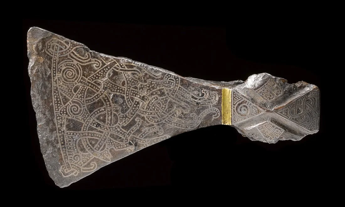
The overall theme is, of course, Viking. I wanted to make something from a culture I was interested in and last year I read the book Norse Mythology by Neil Gaiman so I felt particularly interested in learning more about Norse Mythology and the Vikings. I watched a few documentaries about Vikings and did some personal Google Searches too. Come to find out, I actually have no idea how to make Viking Art. Most people know the runes of the Vikings and the gear (axes, shields, horned helmets, and such) but what about their art? I stumbled across a great resource by Jonas Lau Markussen and it truly changed my perspective on Viking Art. It was fascinating for me to learn about how Viking Art changed through time and the materials used to make this art drastically changed when they adopted Christianity. After some more reading I decided I liked the Mammen style the best so I found a bunch of inspiration from that.
Colors
During this project I went through my Pinterest Board on colors and it turns out I really like the color Red, Orange, and Blue. I picked a few of the images I saved there and made some color palettes. This step of the process was more towards my original idea of Cyberpunk Inventory but I still tried to stick to the palettes to make something not many people have seen before. Going into this I knew I wanted to make something more on the dark side. Not dark as in blacks and greys but more adult and grim. Like Loki broke free from his chains and brought forth Ragnarok.
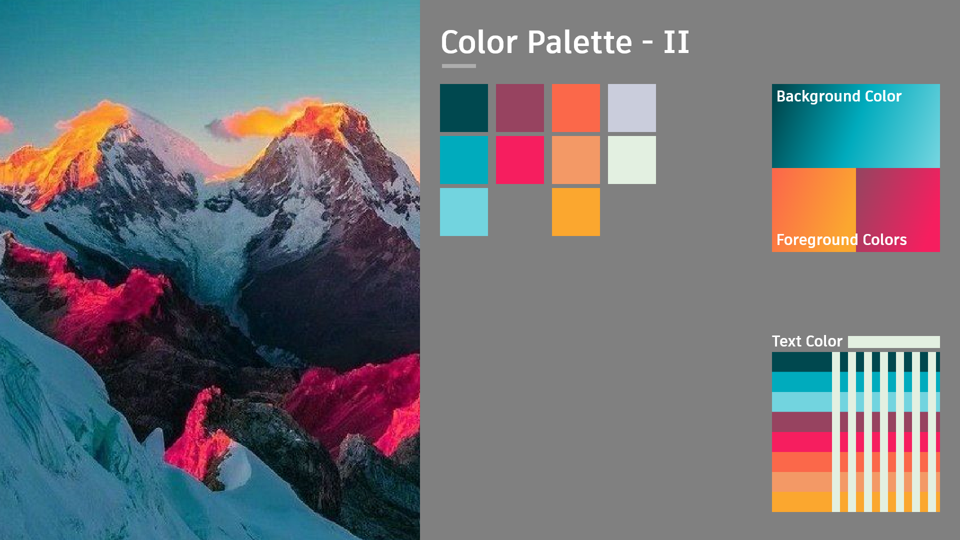
I thought this palette was nice but I thought it might be a little too cheery for what I wanted. Might be a nice palette for a game set on a tropical island at sunset or something like that.
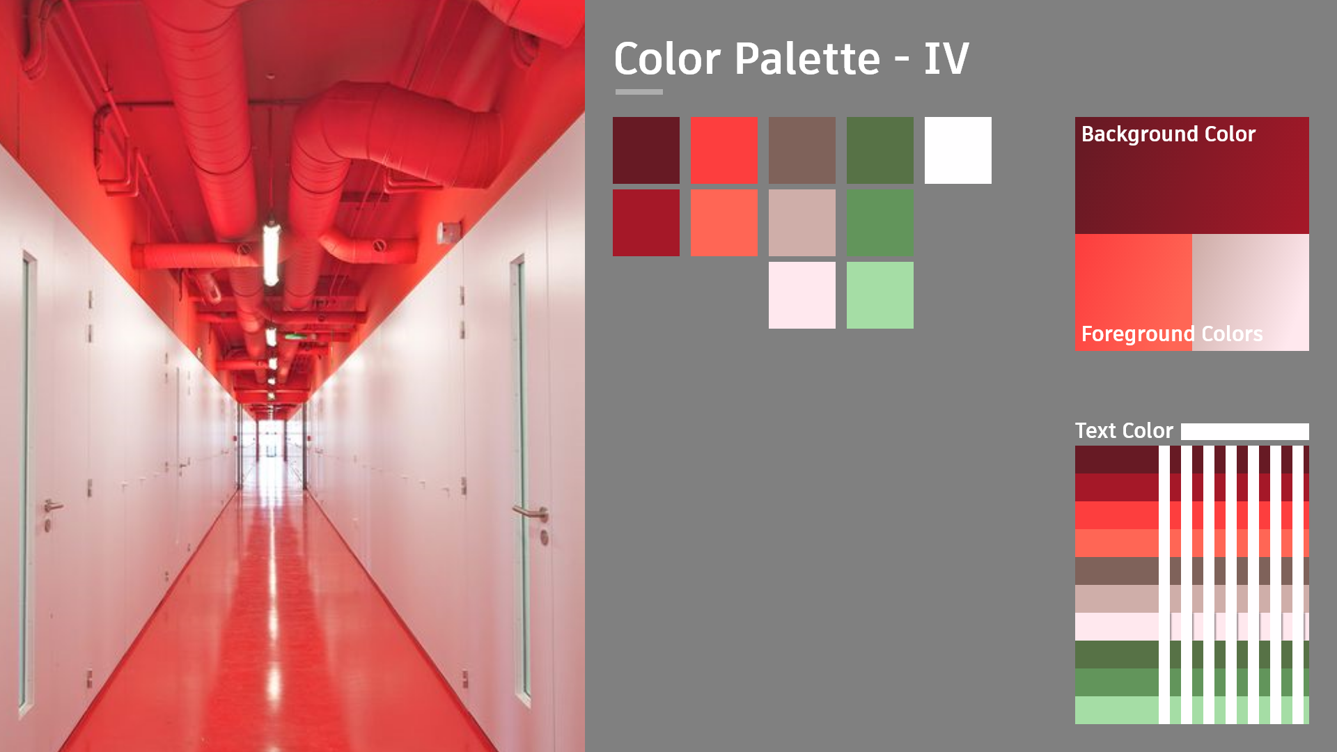
I love how sterile the hallway feels. Like some weird dream that's unsetting but bright. Thought it might be good to translate that into the UI but decided against it. I didn't think sterile was the way to go for this project and the values of these colors might have been too bright for my dark and grim setting.
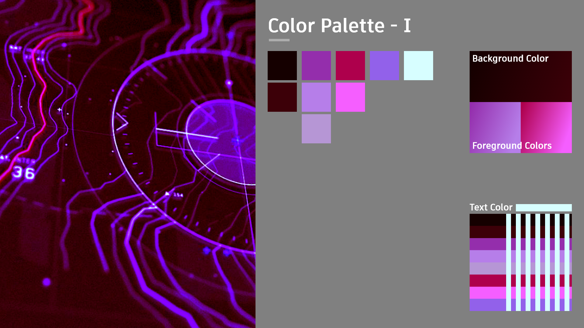
This color palette is pretty much what I went with in the end. I didn't use nearly as many purples and pinks as the palette suggests. I also added a second dark red to the palette to give it a darker feel.
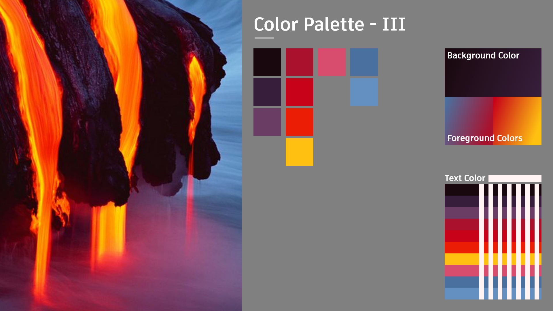
This palette was my runner up. Lots of nice colors here and it probably could've fit well with what the vikings originally painted their art with. I could've used a lot of the dark purples and yellows. I didn't end up picking it because the amount of colors might have been hard to work with. I like the simplicity of 2 or 3 colors.
Wireframes
Component Explorations
Environment Tests
Greybox Wireframe
Shape Study
Texture Composite
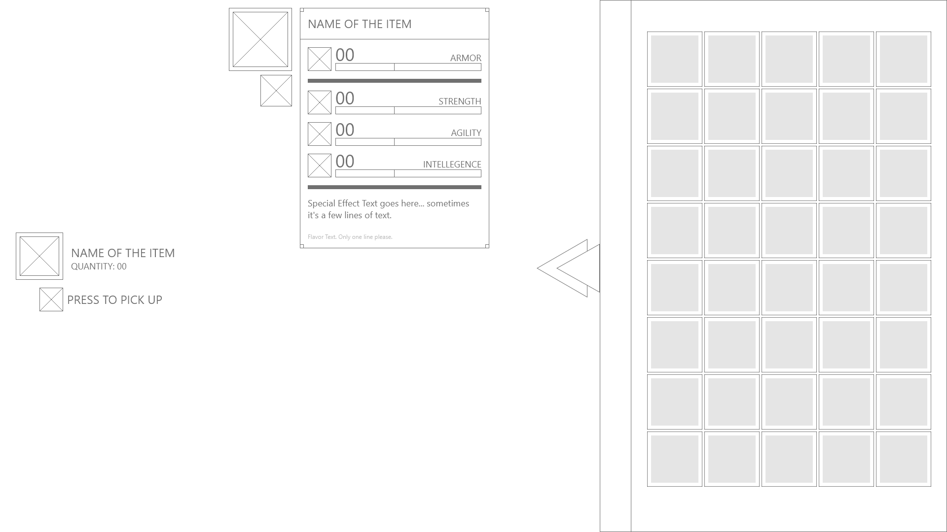
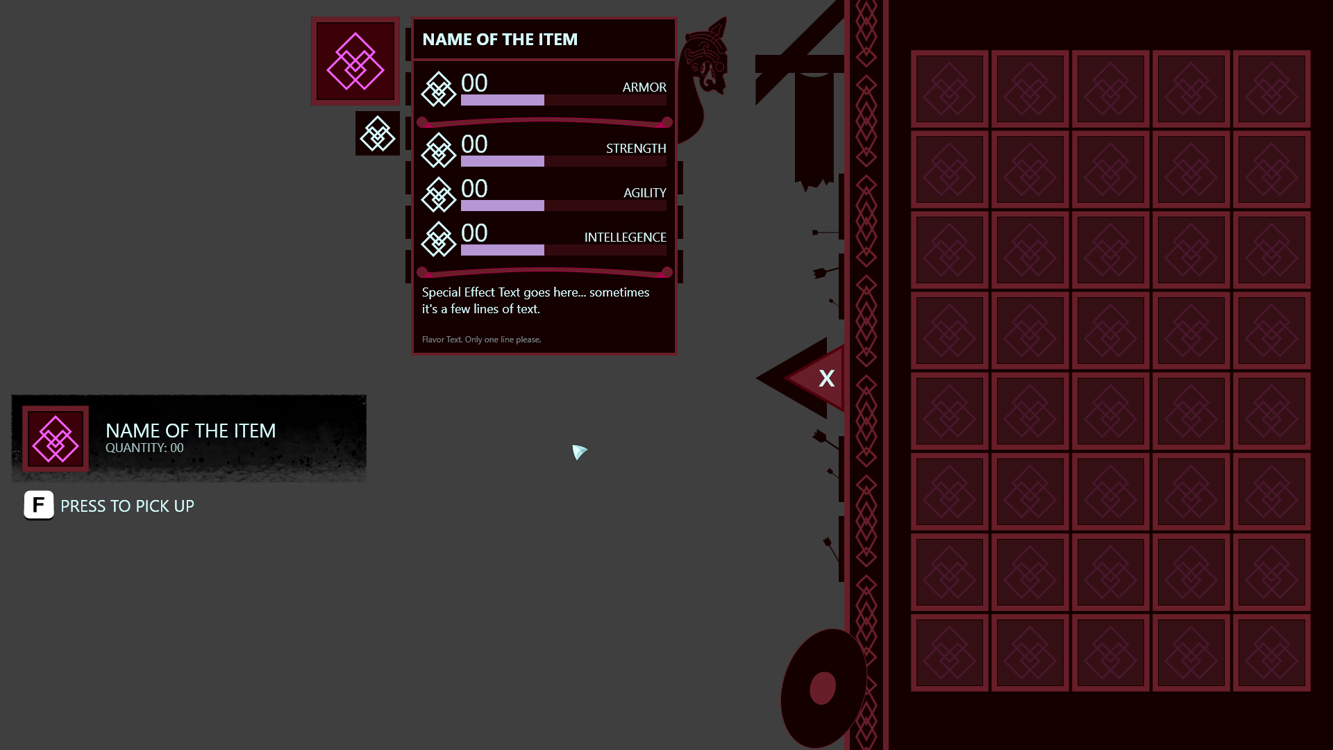
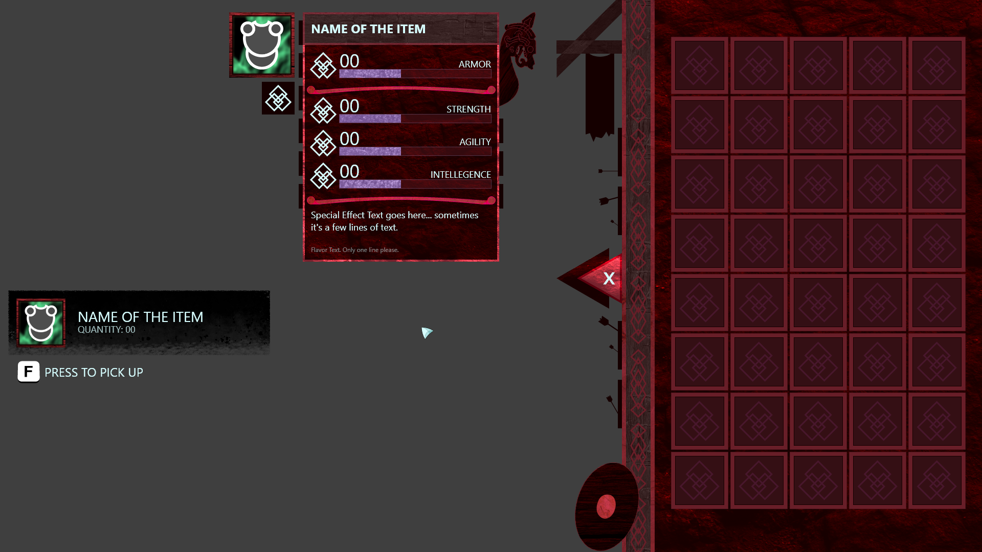
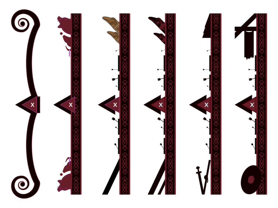
Here are a few explorations for the different UI components. This step in the pre-production process was after my greybox wireframe and during my shape study wireframe. It took the most time to get the border between the world and Inventory to look natural. I spent a lot of time there because that border should be a perfect blend between the in-game world and the UI world.
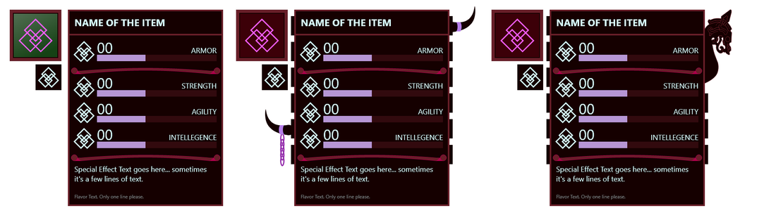
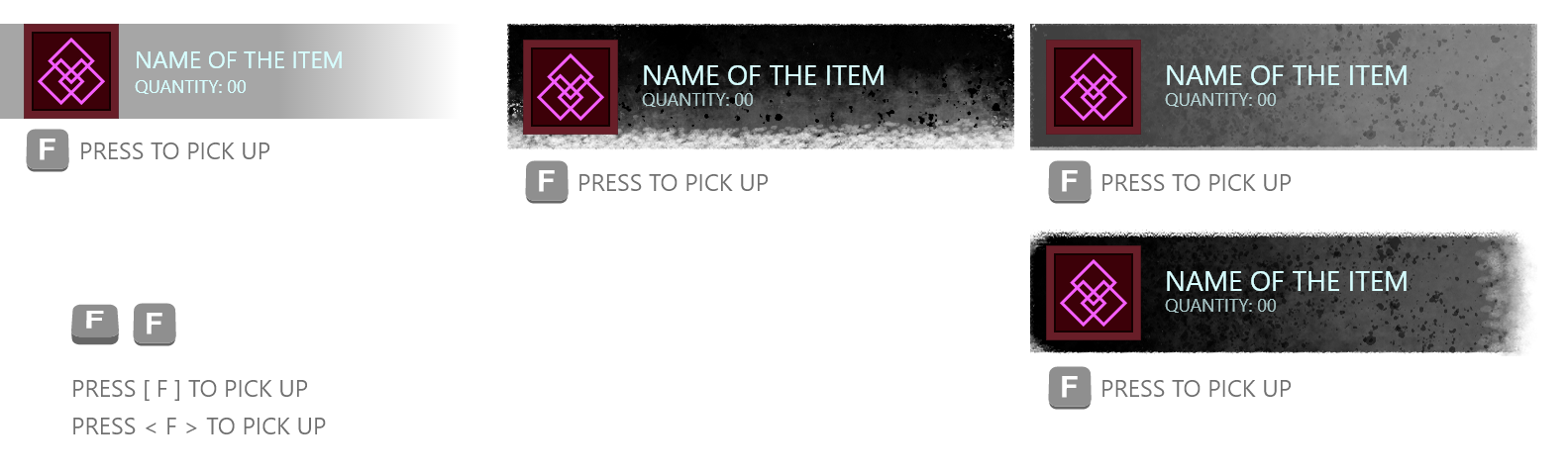
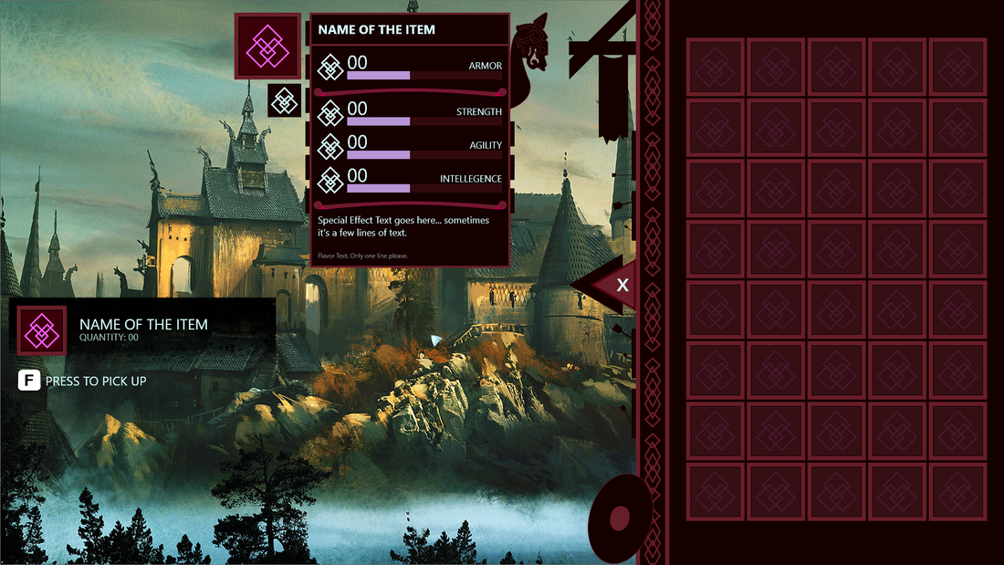
For the Greybox I just figured out the placement of the components on the screen. I knew I wanted a tooltip somewhere and I knew I wanted the Inventory to slide out Diablo-style so you can see what's going on in the world. Maybe the character screen can slide out on the other side or something too.
Here I wanted to figure out what shapes I wanted in the UI. I knew I wanted to push towards a UI that was extremely graphic and had lots of intricate details. I liked the idea of treating the inventory like a storehouse where the player keeps their stuff so I added the beams and banners on the top. And the arrow heads are a nod to the dark and grim theme I wanted. There's fighting going on in the world and even the UI knows it.
After I got the general shapes down I wanted to figure out what everything was made out of. Since I wanted to push the design more towards the skeuomorphic side it was a good exercise to think of how everything was connected and what sort of materials they were made from. Currently there's a lot of wood, stone, and metal but I also liked the idea of some sort of bubbly liquid for the stat bars.
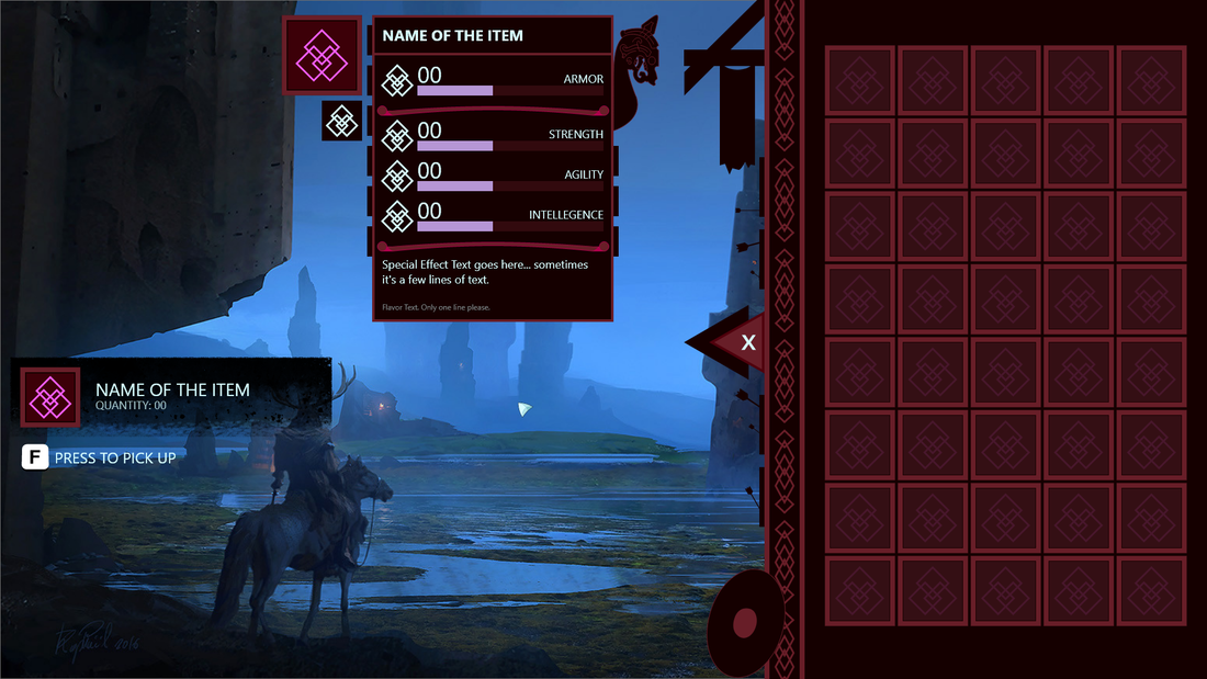
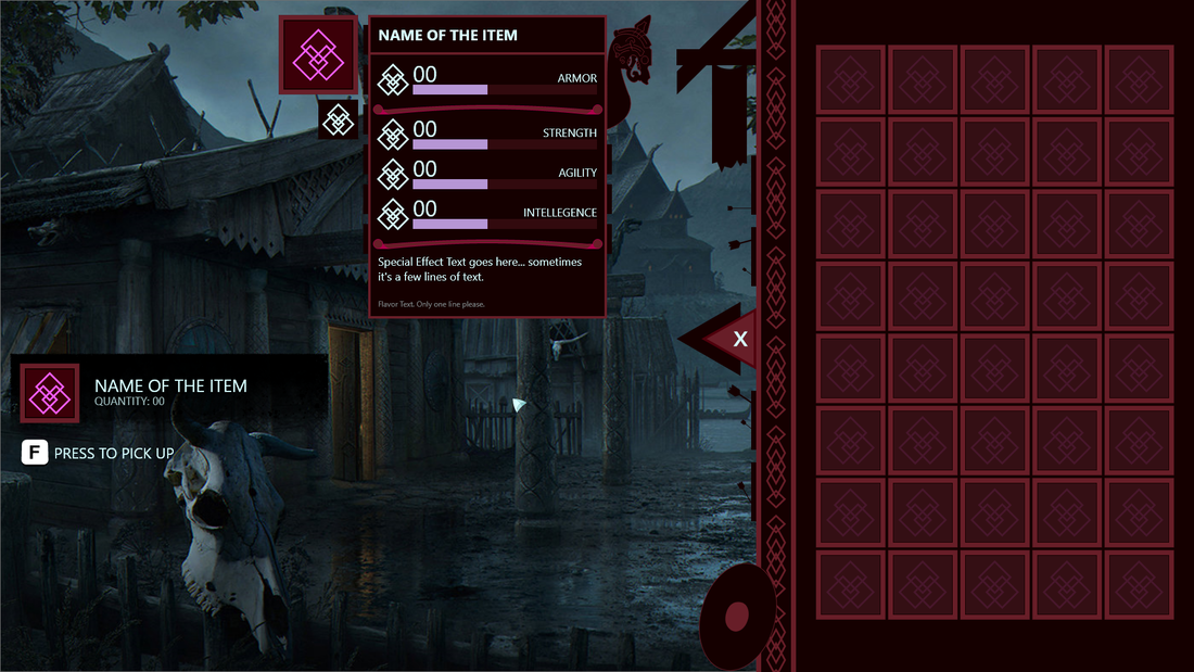
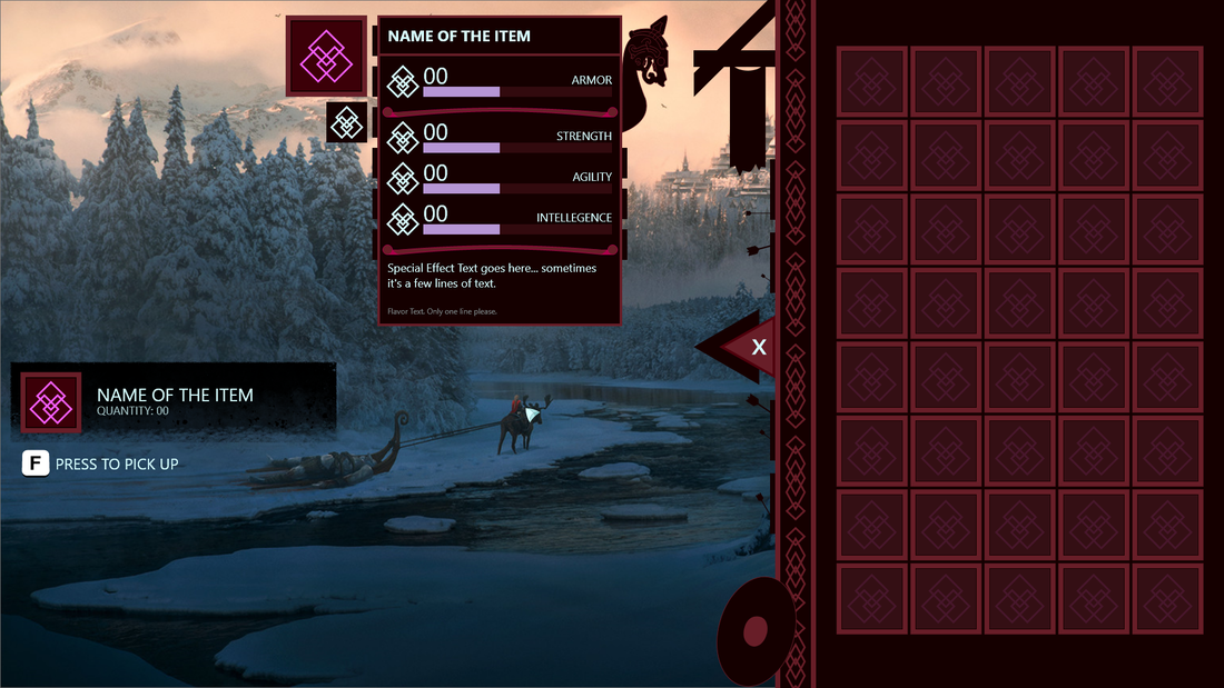
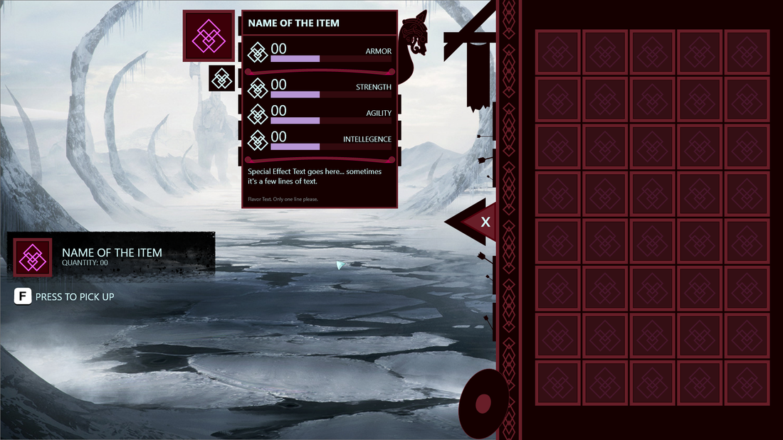
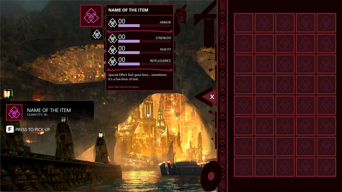
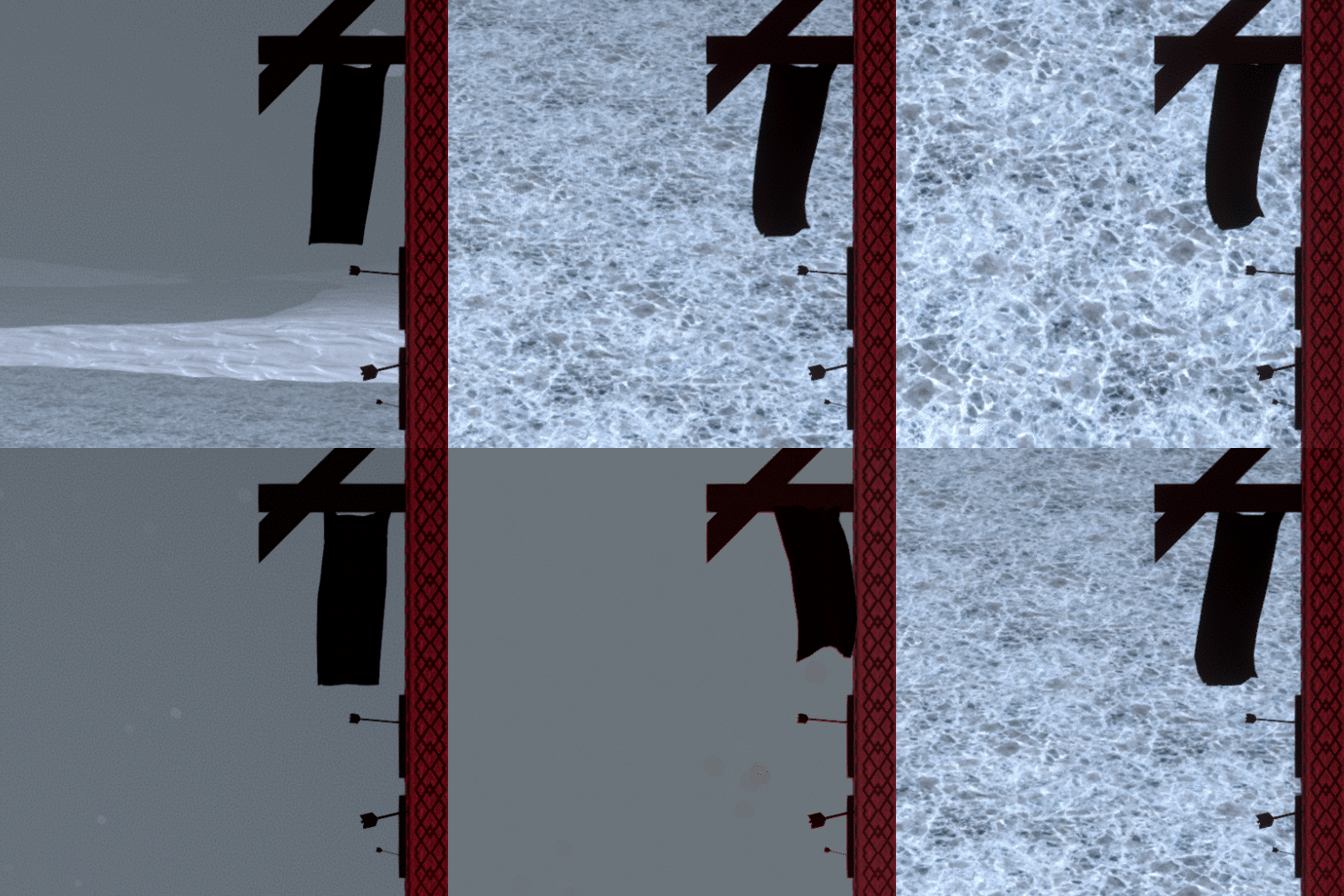
These are a few environment tests to see how my style and shapes would hold up in different places. I tried to use backgrounds that I thought were dark and grim. Somewhere I could see the Viking player going to. I knew that they might not go to a tropical beach or a rain forest so I didn't get a background in those styles.
Custom Typeface
References
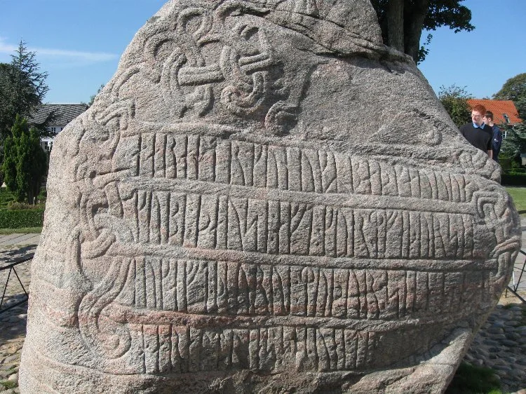
The first reference I took inspiration from was the Jelling Stone and general Viking runestones. These stones gave me direct reference to how the Vikings would've written stuff down. The text here is very narrow and uses a lot of vertical lines to create the forms.
Sketches
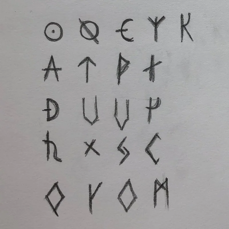
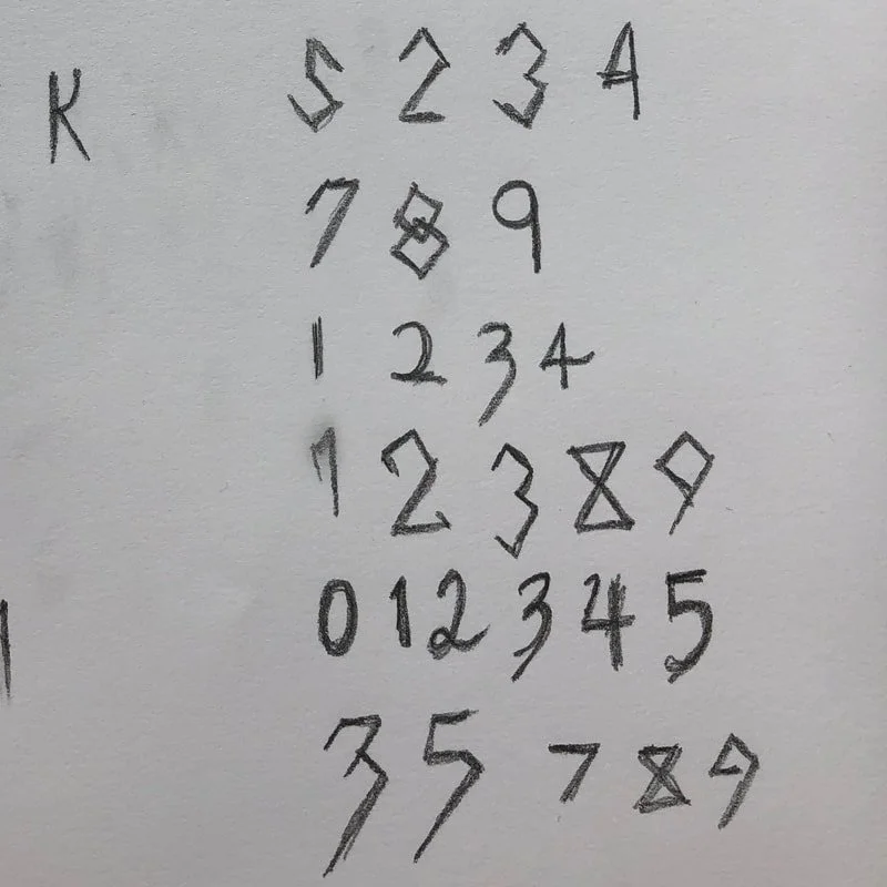
The first thing I did was get out the old pencil and paper to sketch out just a bunch of letters. I wasn't focused on the thickness of letters because I figured I would figure out the thickness and ends when I took it to Illustrator. These sketches were just to get a bunch of ideas on what the shape of the letter was going to be.
Form Refinement
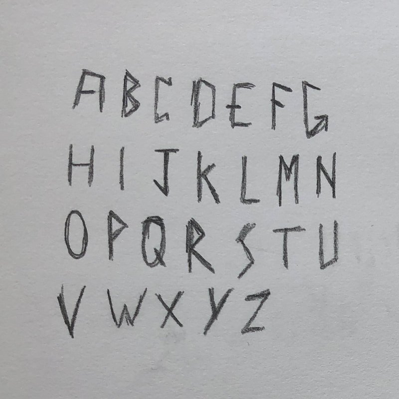
Next it was time to hop into Illustrator and start creating. Although the program I was planning on using has a vector editor, I'm most comfortable in Illustrator and wanted to leverage its power. During my iteration process, I frequently took the letters and hand placed them to make different words. This gave me a sense of what was working and what wasn't. When I felt happy with the forms, it was time to take it into BirdFont to make something I can put into Unity.
Learning BirdFont was a bit tricky since the documentation is a bit sparse. After a few days working with it, I think I've got a decent understanding of it. At least enough understanding to make this simple font.
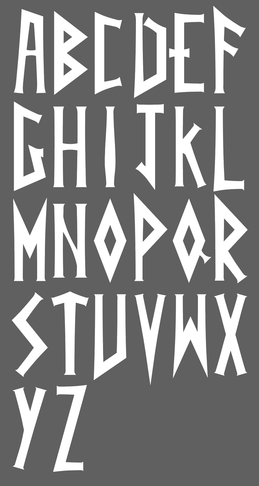
Version 1 | Really angular and hard to read.
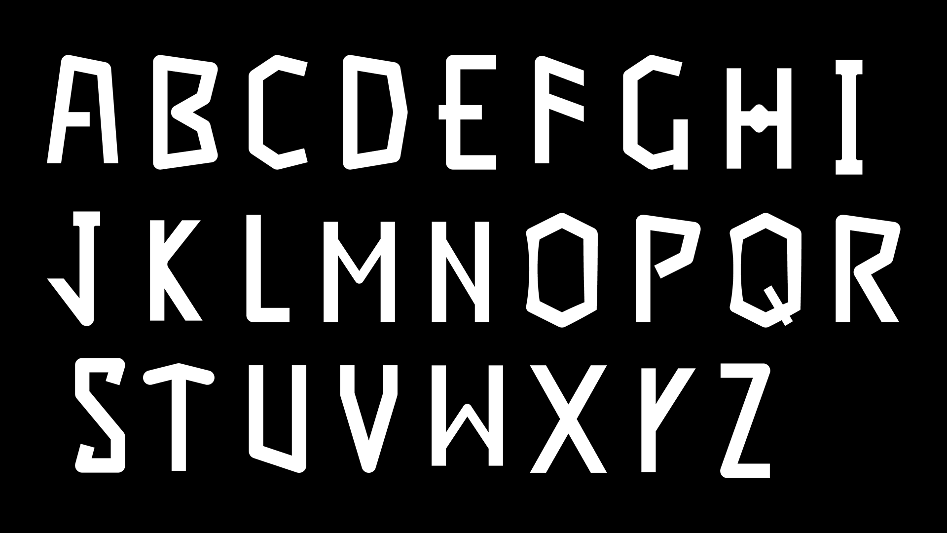
During the process of making the Viking Inventory, I couldn’t find a typeface that I liked for the titles. Everything that I found was either too stylized and illegible or didn’t have enough thematic flare. I decided I wanted to create my own custom typeface for this and learn the process. Before this step, I was completely oblivious to how much work went into creating and maintaining a font.
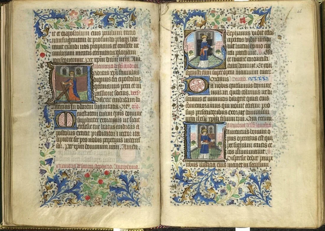
The second reference I used is old medieval books. These books used a lot of vertical lines to create the letters but the text is thicker in a lot of places. I knew I wanted a bold text so I took some inspiration from here too.
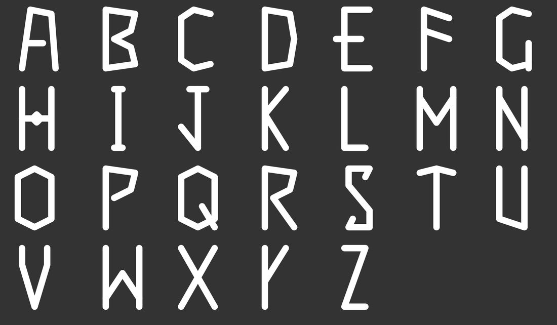
Version 2 | Wider so it’s easier to read but missing the style I was searching for.
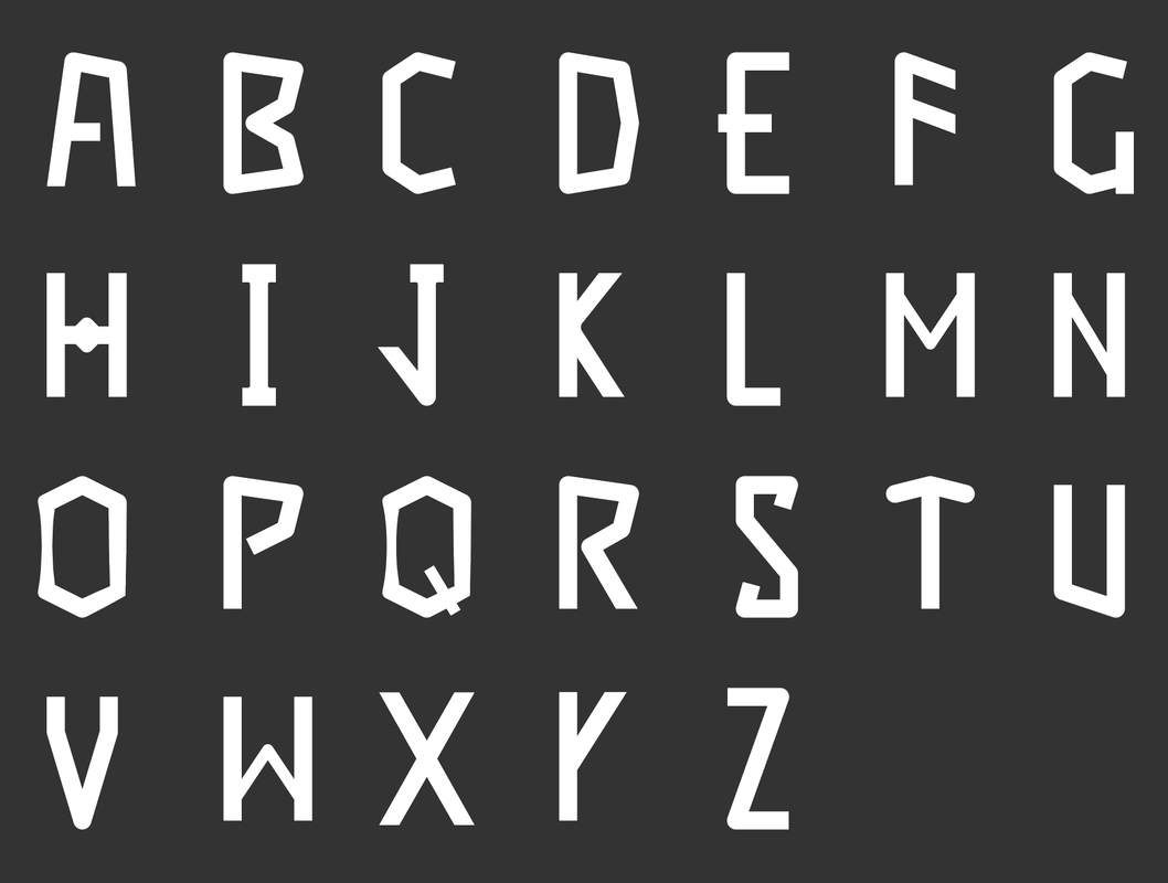
Version 3 | Final version and refinement of Version 2.
Final Implementation
At this step, I put the whole thing together in Unity. There was a lot of work here that is difficult to document and probably wouldn’t be that interesting for a portfolio piece. But I’ll do my best to summarize all the different things I accomplished during this step.
Built a grid-based inventory system that knows what’s in each slot using C#.
Created all the background textures as fully 3D Materials in Substance Designer and implemented them.
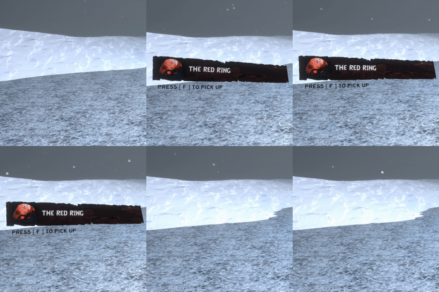
Built a “Pickup” system where you can walk over an item and it’ll show you what it is
Built a tooltip system that recognizes what type of item you’re hovering over and shows you the proper tooltip associated with that type (I.E. if you hover over equipment, it’ll show stats and if you hover over junk it’ll show the junk tooltip).
Implemented sound effects for all major actions like inventory open/close and unique sound effects for each item moving in the inventory (Diablo 2 style).
Got a rigged character model from the asset store and put together a super simple character controller and semi-synced the character’s animations with the walk speed.
Motion Polish
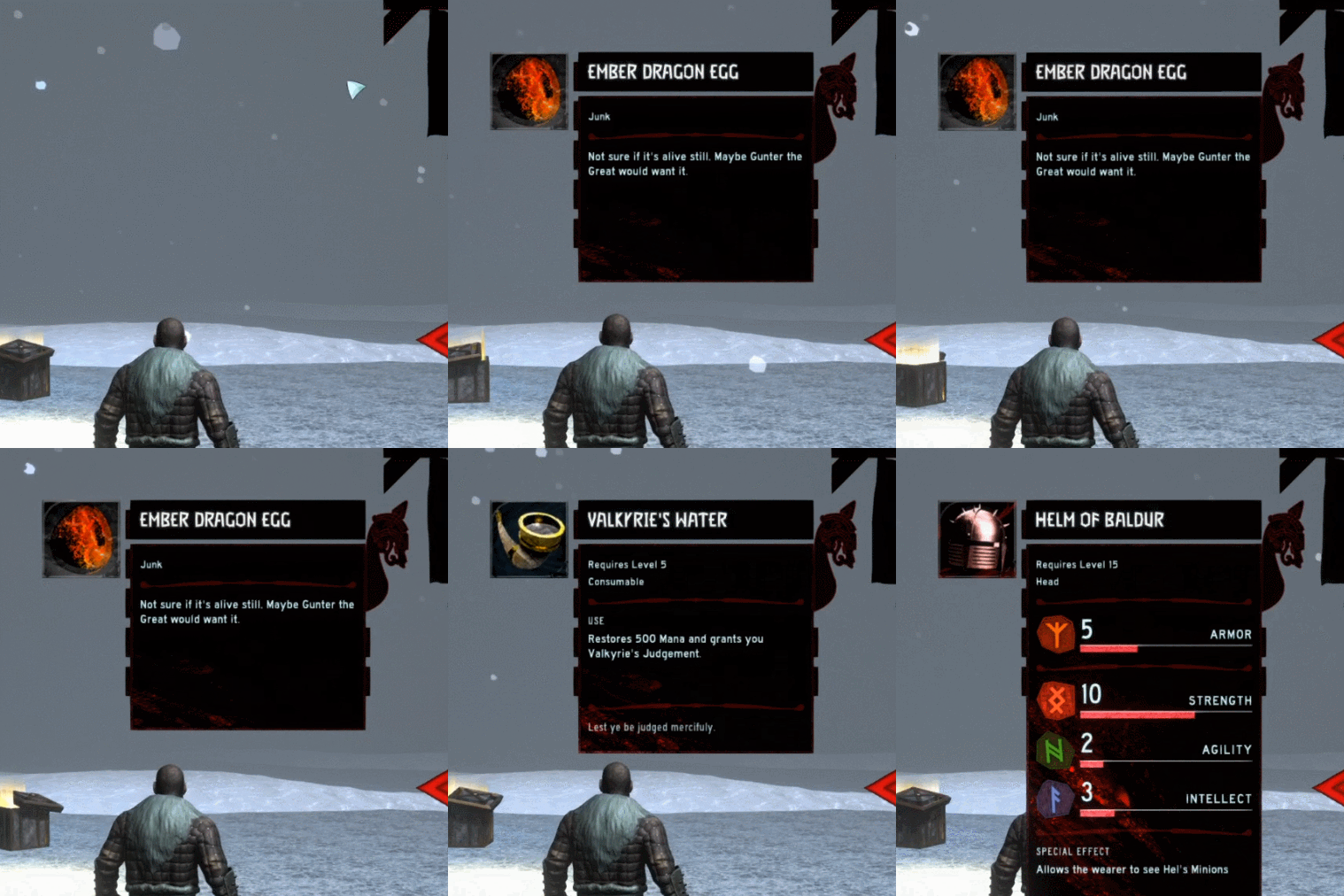
Tooltip Spawn
Implemented with Mechanim
I felt like the tooltips popping in and out was too static and needed some life so I tried my hand at a super simple animation for them. At this time I already had the animation for the Pickup Info so I based the little twist off that. I really wanted to get the speed right since players could be hovering over a bunch of different items over a few seconds. It needed to be quick to get the info but not so quick that it flashes if you're waving your mouse around. I think I struck a decent balance.
Pickup Info Spawn
Implemented with Mechanim
I've been playing some Dishonored 2 lately and I love the motion of the menus. This animation was based off that. It starts with a big twist and settles into place. The trickiest part here was the 'bobbing' it does as an idle animation. At first the bobbing was too subtle so it looked like a jittery bug. But I didn't want it to be too fast so you can't read the text. Like the tooltips, I think I struck a decent balance.
Item Mouse-over
Implemented with Mechanim and C# Scripting
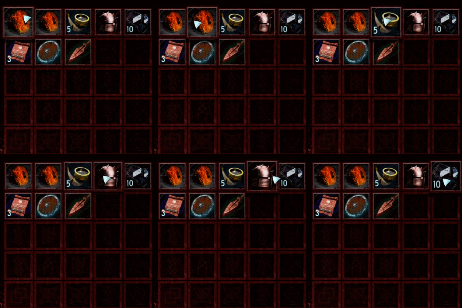
I had lots of ideas and tried many different things with the item hover animation. I originally wanted them to kind of turn based on your mouse position (inspired by the Steam Trading Card hover). But I couldn't get the turn right while I was using a Canvas in Camera Space. So I reverted back to a simple hover. Then I noticed the tiles wouldn't move forward above the ones below so some clipping would happen. I ended up having to disable the grid I set up and change the tile's parent when you hover over it so it would draw on top of all the other tiles.
Inventory Open and Close
Implemented with Mechanim and Triggers
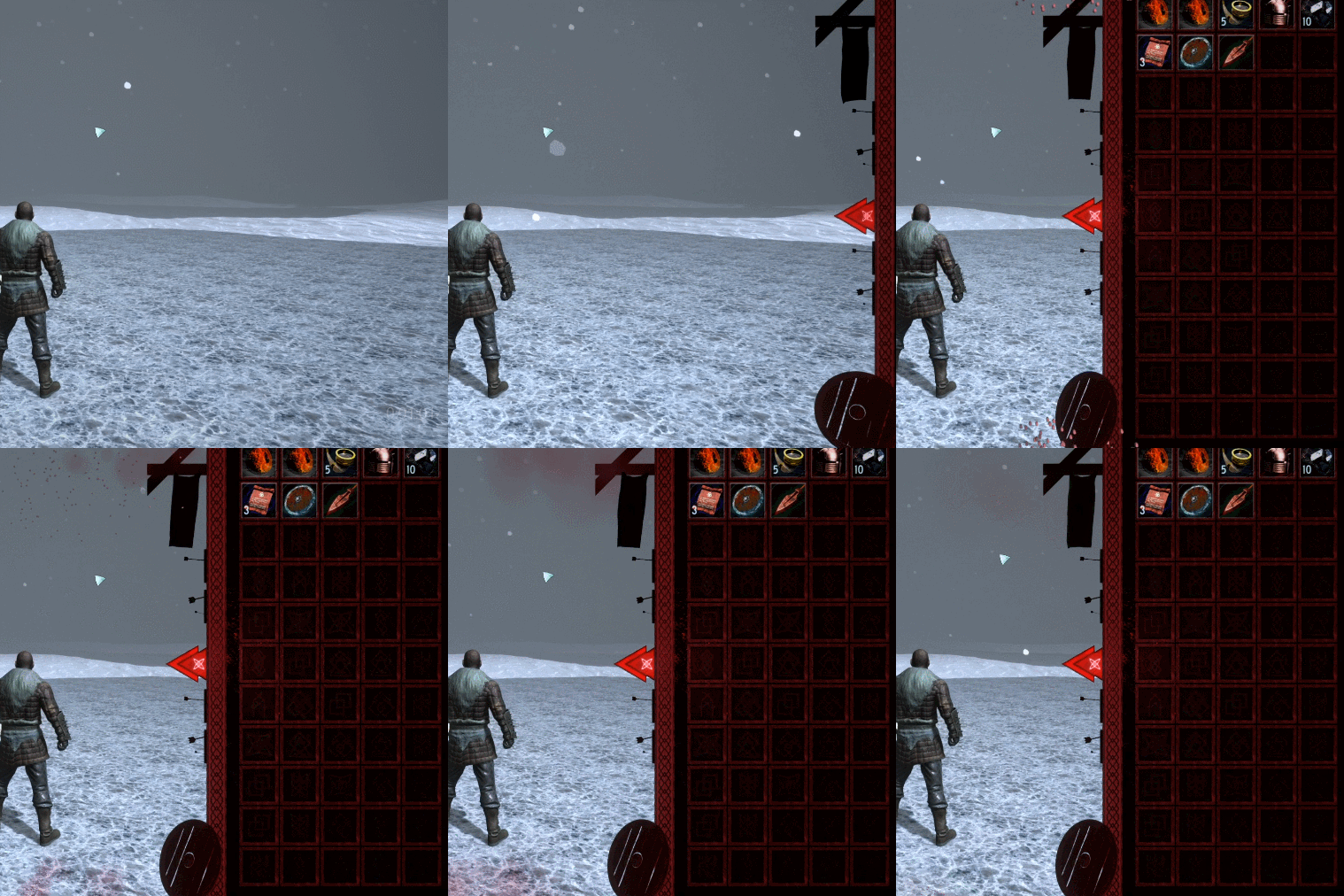
When I mocked up the Inventory I knew I wanted it to slide in and out from the right side of the screen. Something similar in style to Diablo. After playing around with the animation a bit I noticed it didn't have enough oompf. My solution to this was to add particle effects for dust clouds and little bits of debris. The close animation is just the open animation reversed and sped up without the particle effects.
Inventory Slot Highlight
Implemented with C# Scripting and Coroutines
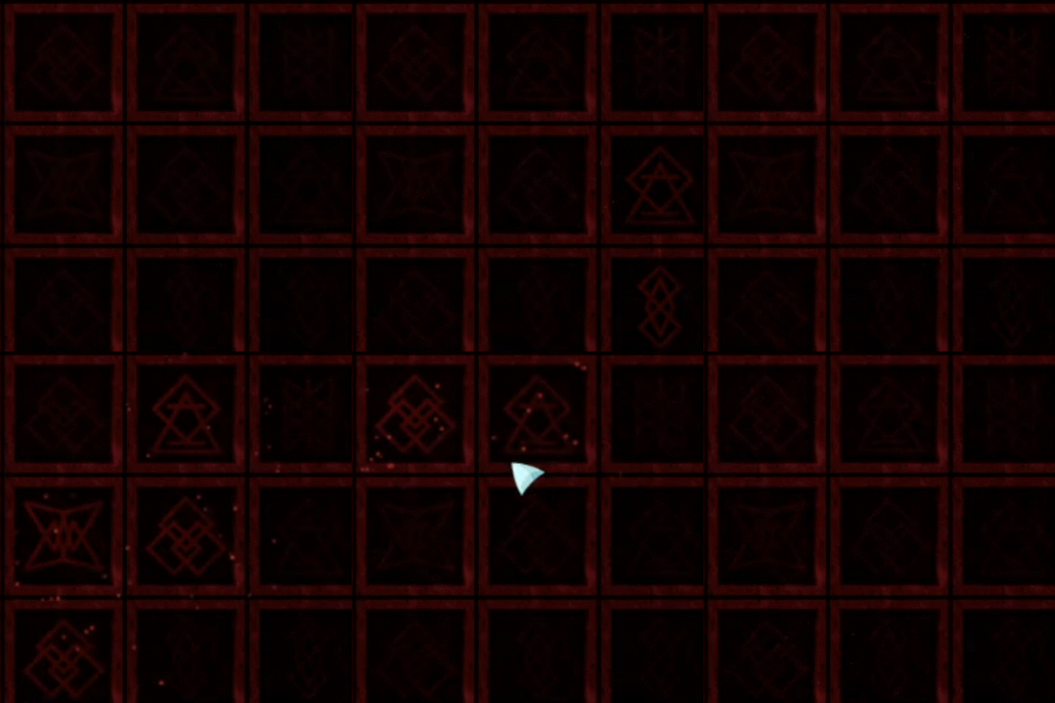
The Slot Highlight was fun because I got to use a cookied light source for the highlight. Each of the slots are given a rune on start and I had to make sure the light cookies matched the rune. From there I would burst a particle effect when you hover and start a coroutine to dim the light slowly. Ended up with a pretty neat effect.
Cloth Banner Wind and Physics
Implemented with Unity’s Cloth System
One of the benefits of using a Camera Space Canvas is I can use fancy physics and 3D Models in it. I have never used any sort of cloth system before so this was an opportunity to learn. I knew I wanted the banner to have a little wind movement based on my mockups so I had a decent idea on how I wanted it. I learned all sorts of things like how to constrain one side so it doesn't move and how to give it a little turbulence. In the end I would've liked it to be a little more slow and flowy but I think the jitter comes from the object being so small.
ADDITIONAL CREDITSMaksim Burgrimov ---------- Viking Ulf model and animations [LINK]
Ted Forbes ------------------ Highway Gothic Narrow and Regular [LINK]
Various Artists -------------- Adobe SFX [LINK]
Aturax Audio ---------------- Cinematic Impacts [LINK]
Substance Source ---------- Iceland Windswept Snow
---------- Thin Ice
---------- Heavy Corroded Brass
---------- Iron Rugged