Dakota Galayde

COLORS IN GAME UI

3/9/2020

 
Picture
This month, we're going to talk about one of my favorite topics in design. Color! I've been diving deeper into color and color theory lately and I'd like to take a look at a few games and break down their color palettes to see what works, what doesn't work, and tinker with them a little to see if I can find something way different than what the developers intended.
​What are colors?
Colors are light. In scientific terms, a color is what the cones of your eye deciphers when an object reflects a wave of light back at you. Every object reflects certain waves of light and absorbs the rest. This is what tells our brains that something is red or something is green.
​Why are colors important?
Colors are an important part of design because they give meaning to an object. A red thing could signal danger or a blue thing could be cold. Colors can also give context in a slightly ambiguous situation. If you see a green cone on top of a brown cylinder we can assume that's a tree. The colors give context and meaning to each part of the tree.
​How do you pick good colors?
Picking good colors is hard and some people dedicate their life to picking good colors. Generally people like to pick colors within a certain color harmony. Complementary, Triadic, Compound, and even Rectangular. But often, those are used when picking multiple colors. A good single color is usually something that gives meaning or context while a bad color hurts your eyes.

ruiner

Picture
Picture
Picture
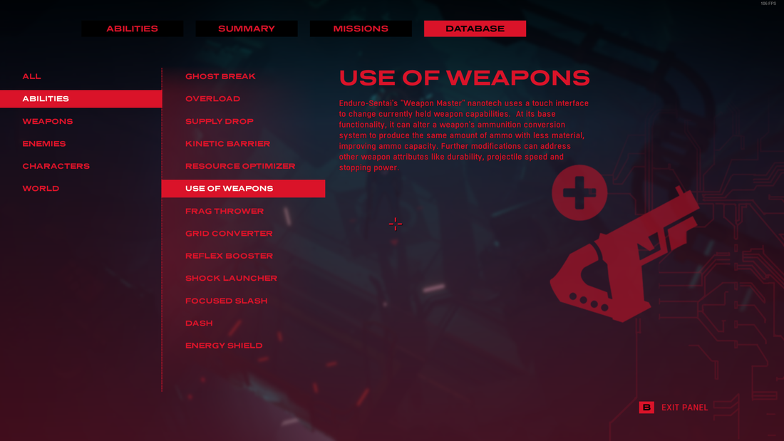
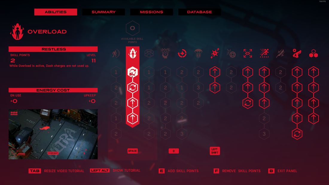
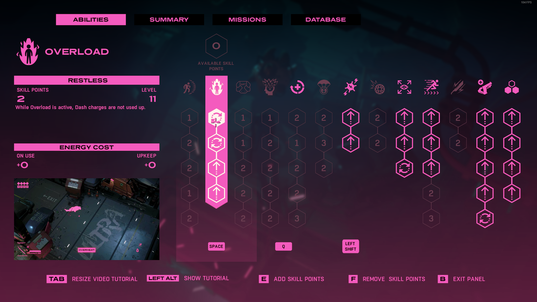
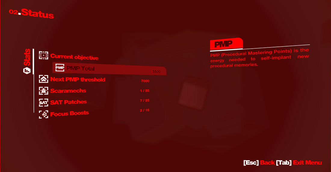
Ruiner uses a very distinct all red color palette for their UI. The monochrome palette here gives a sense of power and anger with the red. When I first played through Ruiner I thought the red was the brightest read I've ever seen. But now that I'm looking at it, it kind of has a little purple in it. The blue in the background of these screenshots is the particularly blue environment I happen to be standing in. What I find interesting is the developers managed to find a black that isn't difficult to read on the red background. Usually white text goes good with a red background but by using both black and white they are able to create a dynamic visual hierarchy without adding any more colors.
Color Explorations
Picture
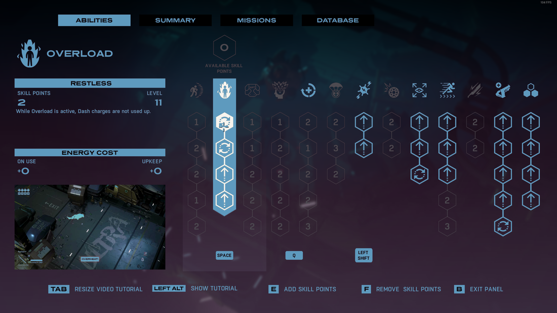
Electric Blue
The electric blue color reminds me of the police. Maybe if you played as a Police man in the Ruiner world instead of Puppy then this would be a good color palette. The blue gives me a sense of calmness and professionalism. Like I'm meandering through the talents menu at my leisure, not in any hurry to crack skulls or beat people up.
Picture
​Fun Times Pink
I thought this pink was funny because of the stark contrast to the theme of the game. To me, this pink looks very soft and fun. Like the color of pepto bismol or something (although pepto bismol is usually not fun). It makes me think about what this menu would look like if it was in Saint's Row.
Picture
Energy ​Yellow
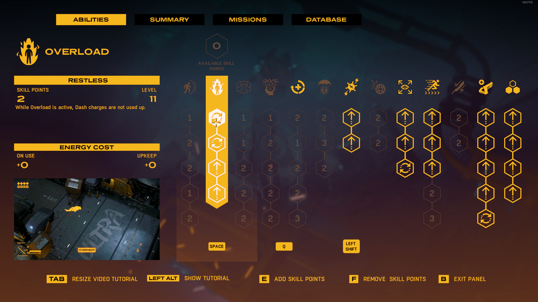
I actually really like this yellow. It's energetic and motivating. Although it did have a bit of an unintentional side-effect. The visual hierarchy is thrown off because the white icons on yellow background end up pushing it back too far and your eyes move towards the left and right sides of the screen first and not the thing you're selecting.

Remember me

Picture
Picture
Picture
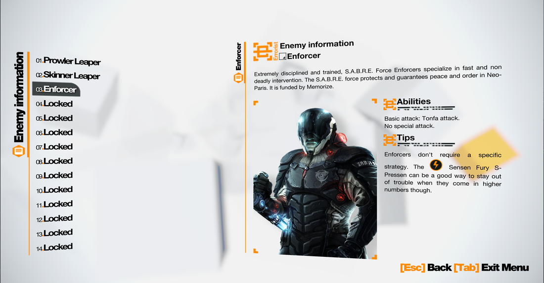
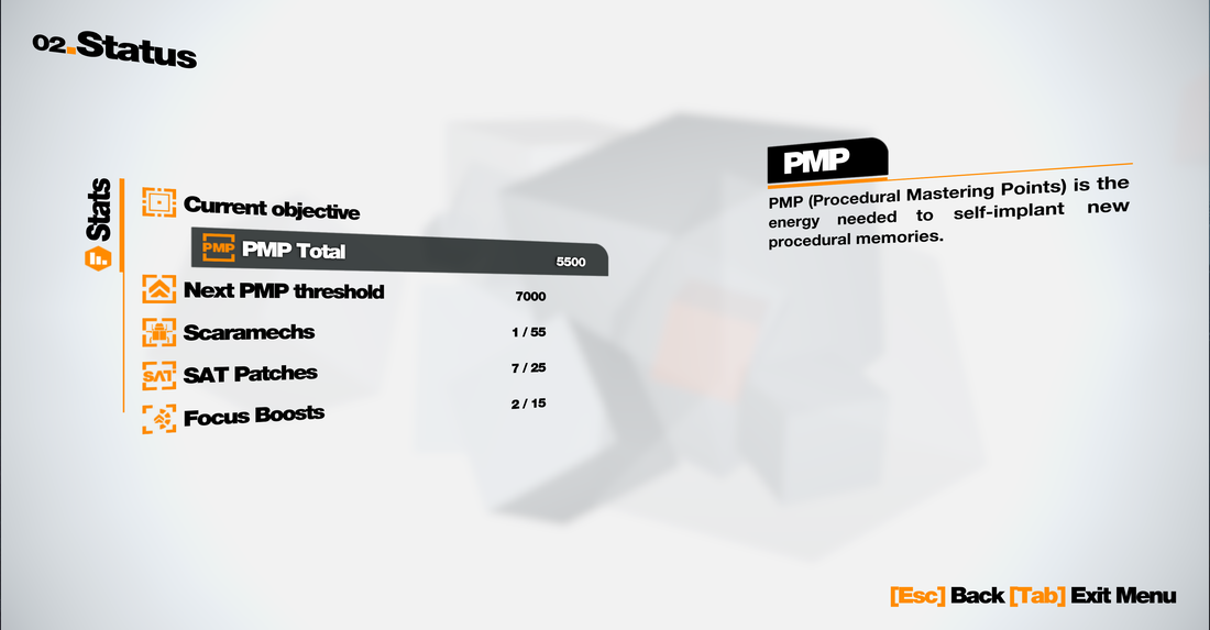
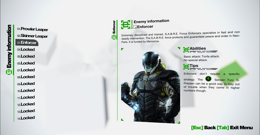
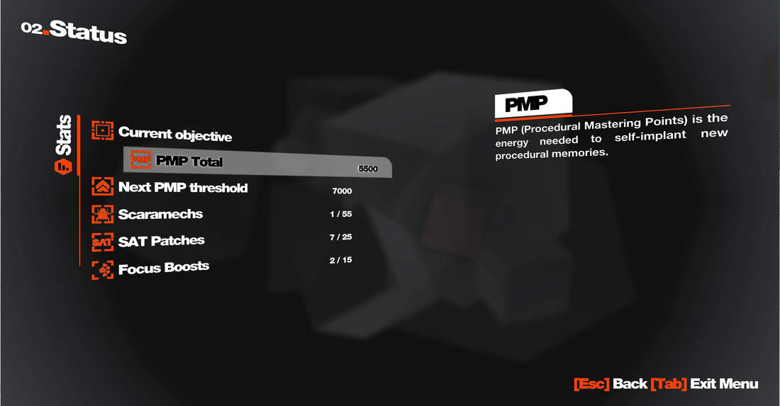
I think Remember Me's color palette is super clean and simple. It looks like they are stark believers in the 60/30/10 rule. The 60/30/10 rule says that your primary color (in this case white) would be used 60% of the time, your secondary color (black here) would be used 30% of the time, and the accent color would be used 10% of the time. This doesn't seem too hard to achieve in Remember Me's case since their background is white and they just have to use black with hints of orange to get the 60/30/10 rule but it's there none-the-less. Remember Me's color palette is very corporate (which is probably what they were going for with the Sensen). The white gives me a sense of purity and cleanliness while the orange shoots a little energy into the otherwise black and white corporation.
Color Explorations
Picture
Natural Green
I tried changing the orange to green to give it a more natural look. Like the menu was designed by someone from a futuristic corporation. That corporation's goal might be to save the planet from deforestation or maybe destroy all civilization so they can return to nature. The orange definitely pops forward more compared to the green color. The green gives the menu a soft look and lets your eyes gently flit around the screen as they will.
Picture
Inverted​ with Red
I wanted to see what would happen if the screen looked the opposite of clean and corporate so I inverted the colors and gave the orange a small injection of red. I think your eyes travel across the screen in the same way but, to me, this seems much more 'glitchy' than the clean white. Maybe this color palette would be good for an edgy hacker who does a lot more with 'the underground' side of the world with their hooded cloak up all the time.
Picture
​Ruiner
After looking at the Ruiner color palette I was wondering what it would look like on other games. Although I don't like how the selection looks, I think this look is very aggressive and powerful. Makes me angry and anxious just looking at it! Maybe this would be a good palette if the game were more about combat instead of about hacking memories and taking down big corps.

​transistor

Picture
Picture
Picture
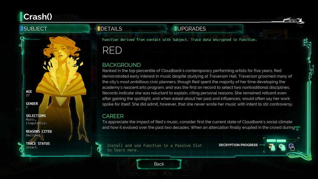
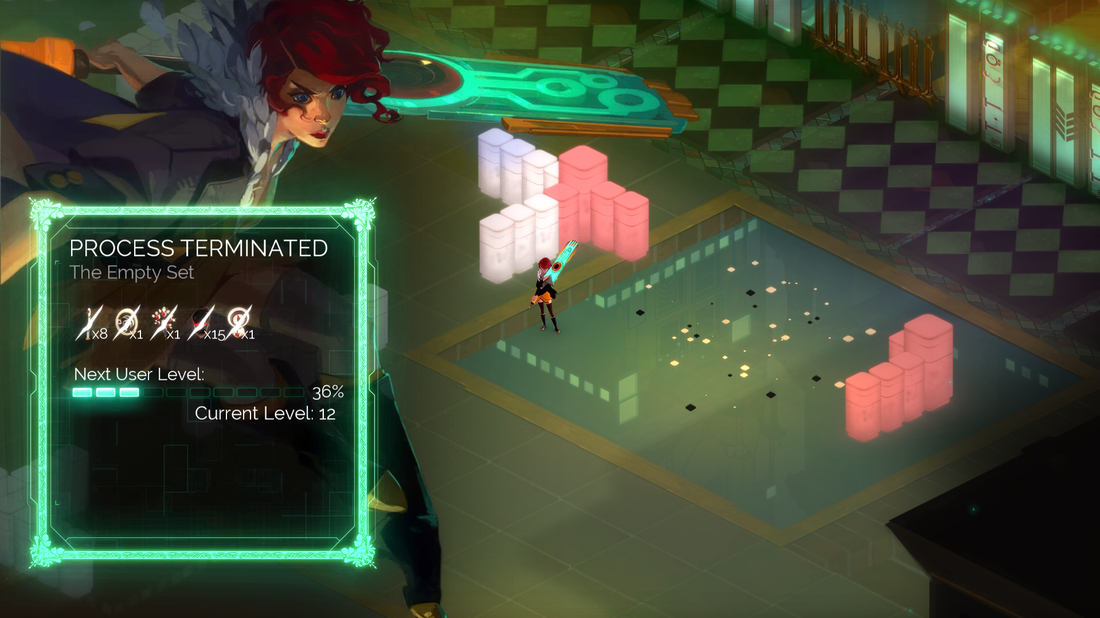
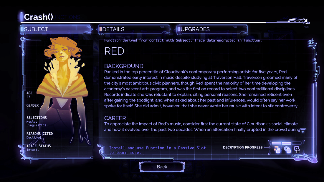
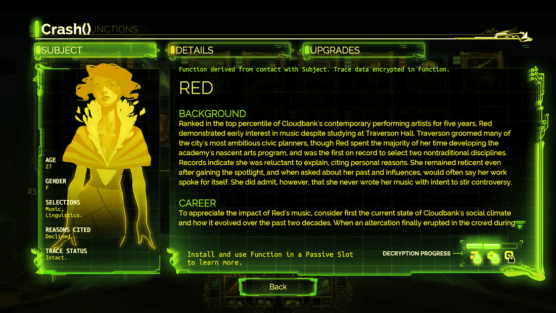
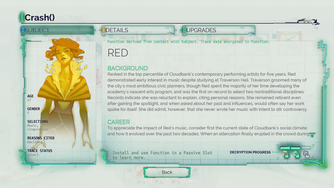
Transistor uses a lot of cyan, teal, blue, and green. Occasionally you'll see splashes of yellow or gold like in the Details tab on the left image. This color palette reminds me of the ocean but the art-deco style and outer glow give make it look more like Neon lights. Since green is often used as a relaxing color and blue is often seen as trustworthy, I think the color choice has a calming effect on the game. Like you're going through all this stuff but it's okay. You can trust your sword boyfriend and he will calm you down.
​Color Explorations
Picture
​Blurple
I started tweaking the colors of the Transistor screen and came across this blue/purple color. It's definitely darker than the teal normally used so it doesn't give me as much of a "neon lights" feeling. But it still makes me feel trusting. Some of the contrast is lost with this blurple color like in the text right above the back button and some of the letters that overlap Red's Portrait. We also lost some of the color separation between the headers and the body text (like "Career" and "Background")
Picture
Radioactive Green
I wanted to know what it might be like if we made the screen look evil. Not like red powerful but more like an elegant evil. I came up with this toxic/radioactive green. It reminds me very much of a sewer or radioactive rocks. It's very bright and in-your-face with a huge amount of contrast to the black background. I think it could use a little more yellow in it to make it even more evil but overall I like it!
Picture
​White Background
Transistor's menus all have a black background. I wondered whether a white background could make it look elegant and sophisticated like a marble column or something. While I think I could've darkened the teal colors to give a bit more contrast, I think the white does look more elegant. Maybe this would've been what Red's UI looked like before she got attacked and the events unfolded. To me it looks much more sterile and soft.

grim dawn

Picture
Picture
Picture
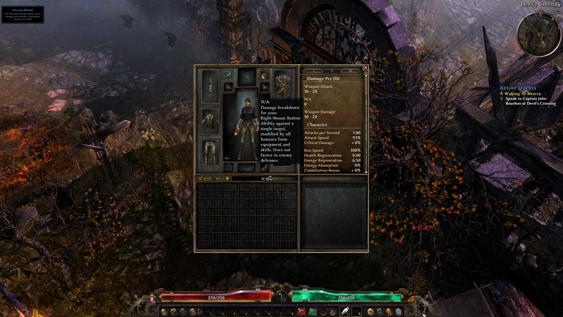
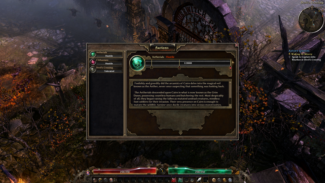
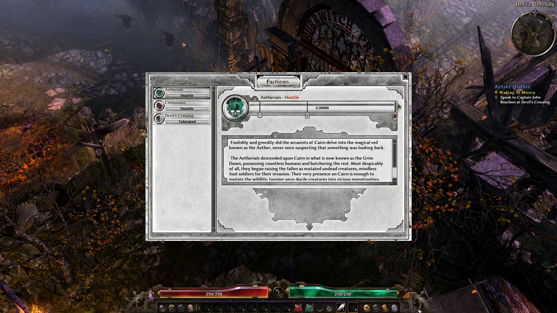
We've all played a game where the Menus used a color palette like this. Browns, greys, and blacks galore. There's nothing wrong with a brown color palette. It usually tries to root itself in the real-world by texturing visuals to make them look like steel, wood, paper, dirt, leather, and other 'natural' materials. This was the first time I've played Grim Dawn and I picked it because I wanted to see what would happen if we started changing the colors of the menus while the gameplay color palette stayed the same. In the previous explorations we've been looking at full-screen menus but now it's time to look at a modal with the game still running in the background.
​Color Explorations
Picture
Poison Green
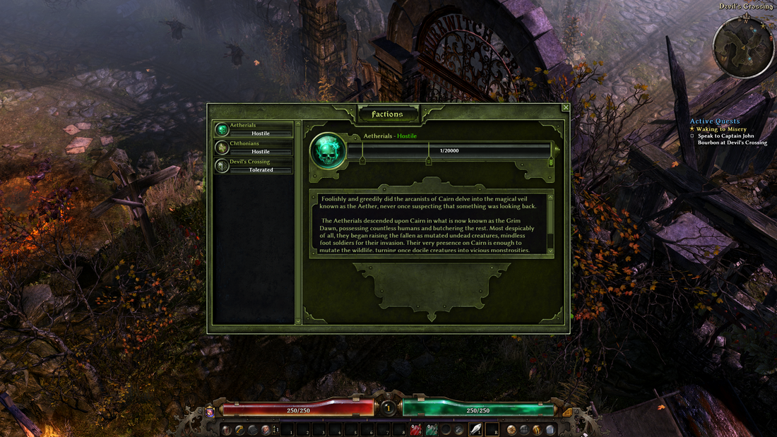
I wanted to keep my color explorations keeping the theme of evil, dark, or death. So I went for a sickly green meant to look poisonous. While the original UI keeps the same color palette to the gameplay, this color palette is close enough to the original that it looks off to me. Maybe if the gameplay colors were more grey with splashes of green then it would look better. I do notice that in this particular picture, the green menu completes a triadic color scheme with the orange of the leaves, purple of the arches, and the green of the menu.
Picture
​Void Purple
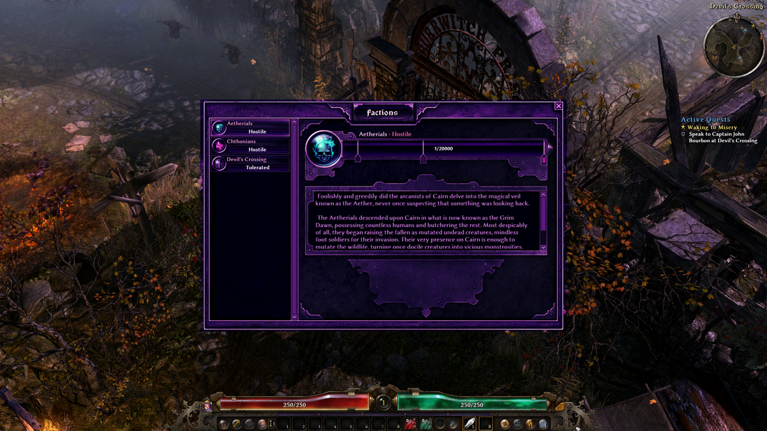
I wanted to try a deep dark purple I'm calling "void purple". It keeps the image complementary with the orange leaves and purple arches and menu. I feel like I lost some of the readability with the text in the center so I might have needed to try to make that lighter. More contrast with text is always a good idea. I do like how dark the value is though. Definitely makes it look 'Grim'.
Picture
​Marble
Lastly, I wanted to invert the colors a little to see how a super light grey would look in contrast to the background. The white marble look reminds me of some old-school RPG. I'm not sure if that's because my cropping gave it sharp corners or if its because of the white. While Remember Me and my Transistor test look elegant, soft, and clean, this white somehow still looks evil and dirty. 

Lessons learned

Here are some lessons learned from my color explorations:
  • Textures on UI can make a color feel differently than intended.
  • There's nothing wrong with a natural color palette.
  • Make sure contrast with text is high enough to be readable.
  • White backgrounds usually make the UI feel clean while black backgrounds give a sense of danger.
  • Monochromatic UI can work if done correctly.
  • The color you choose can influence how the player plays the game.

LOADING SCREEN STUDY

2/10/2020

 
Picture
What is Loading?
Loading... a simple word that almost everyone hates seeing. Whether if your Google search, video game, or even this blog post, all things must load.

So what is loading? Without getting technical, loading is when the application is trying to get stuff from somewhere and put it where it belongs. Most of the time this stuff is hi-rez art but all the information comes in as 0s and 1s. Sometimes the application is getting the info from the internet. Other times it's getting the info from a special hidden file in your computer. Either way, just like it takes time for you to move from your kitchen table to work, it takes time to move the Apple Texture to the Apple Model.
What makes a good Loading Screen?
Everyone knows what a loading screen looks like and some people have even sat through bad ones. But what makes one good and one bad? Now-a-days, everyone knows to have some sort of information on the screen to tell you that it's loading and if it froze.

Last month, we talked about Transitions and how they can be used to give context to a player's experience. This month, we'll be looking at all the moving bits on 15 different loading screens and see if we can break them down.

Simple Loading

Simple Loading is the most common type of loading in video games. With Simple Loading, there's very few moving parts on the screen. There's often just enough to tell you if the game's frozen but sometimes it doesn't even tell you that. This type of loading uses art and/or gameplay tips to keep you engaged long enough so you won't notice that you've been sitting there for a few minutes now.
Divinity: Original Sin 2
Divinity Original Sin 2 is a fantastic game. Larian Studios goes the route of simple loading bar and some bad ass art to show off their diverse cast of characters. There's even a nice shine that flows through the loading bar to let you know that it's still doing something. What's a little funky about this loading screen is the 2nd load. After the loading bar fills up it disappears and is replaced with a spinner. The spinner is actually my favorite part of this loading screen (aside from The Red Prince!). After the spinner disappears there's a gentle fade in/out and we are in the game.
Bioshock: Infinite
Bioshock Infinite's Loading Screen is extremely flavorful to the story they're trying to tell. The loading screen is piece of art that tells you all sorts of background information on Booker and Elizabeth. The only constantly moving part on the screen is the spinning sky hook. It'll tell you a little blurb about where you're going next and then literally drop you in the game. It seems like at the very end the loading screen fades into the game. Like they just turned the opacity down and called it good. I probably would've done a fade-to-black and then fade in but it's not super noticeable in-game.
World of Warcraft
A classic load screen (but not WoW Classic!). The video above shows me loading into Pandaria. Each loading screen has different artwork depending on the continent you're loading into. WoW uses tips to keep the player engaged. Sometimes you'll even get a tip saying "Thanks for playing" or something along those lines. Overall really simple, nothing fancy, and no moving parts other than the loading bar. It is worth noting, however, that WoW continues to load after the loading screen has ended. They want to load bare minimum first and then load the pretty art after the player is in the game.
The Legend of Zelda: Breath of the Wild
Breath of the Wild does a great job of making a simple loading screen with a twist. The loading bar is hidden within the logo and they call out your progression with little moving Divine Beasts once you defeat them. In case that wasn't enough they put a little icon in the bottom left corner to further reinforce that the game is doing stuff. I also really like that you can control the tip switching in case you're a slow reader or you already saw the tip.
This War of Mine
Simple as simple can be. This War of Mine pulls out a loading screen without art and without bars or spinners but still manages to tell you something's happening through the subtle flashing of the text. I actually really like the simplicity of it. I especially like the gentle fades. Definitely gives a sense of the hardships you have ahead.
Dishonored 2
When I first thought about including Dishonored 2 on this list I put it in the next section, Animated Loading. Turns out the loading screen isn't animated! They just do a really good job of suggesting movement and depth with their panels and artwork! Definitely does a good job of keeping you entertained for the first load in each area but after that it can get a little repetitive. The only moving part on the screen is my brain playing tricks on me and the loading bar.

Animated Loading

Animated loading takes simple loading to the next level (literally!). Animated loading screens sacrifice a bit of load time for style. They usually give flavor to the world and keep the player engaged with fancy art. Animated loading screens are not separate from simple loading screens and usually have similar elements. Loading bars, spinners, gameplay tips, lore facts, and stuff like that.
Rise of the Tomb Raider
The Rise of the Tomb Raider is one of my all-time favorite loading screens. When I was playing through this game I was always happy to see that topographic map animate in. There's something really satisfying with how everything unfolds into position and then the map blinks in. Like you're starting up your GPS Tracker and getting ready to go out into the world. The loading screen also has a little spinner above the logo to have something on the screen at all times. And Tomb Raider wanted to put gameplay tips on the loading screen as well.
Dead Island
Dead Island does a really nice parallax effect when loading. The movement from left to right in addition to the flakes of debris in the foreground give you a sense of running (or more like a quick side-step). Dead Island adds your loading destination to the top right corner and a gameplay tip on the bottom of the screen. The transition out of the loading screen is a little abrupt though with a quick cut-to-black and a fade-in. It would've been nice to see a fade-to-black instead of a cut.
The Elder Scrolls: Skyrim
Everyone has probably played Skyrim at this point. It's loading screens are really simple but I would still consider this one an animated loading screen. The game shows off the 3D Model by slowly rotating it and zooming the camera in. If the loading screen takes longer than normal the zooming and spinning slows to a crawl eventually being barely perceptible. The tip on the loading screen usually has to do with the 3D model that's being presented too.

Hidden loading

Hidden loading takes a loading screen and twists it a bit so the player might not even know it happened. Sometimes this is done through asynchronous loading while you're walking down a long corridor or riding an elevator. Other times developers like to hide the loading behind cinematics. Either way, the goal of Hidden Loading is to keep the player immersed in the game.
Resident Evil
Whenever Resident Evil needed to load into a new area they used a door opening animation. The video above is from the remade version but even with the advancements in technology they wanted to keep the door opening animations. The camera fades into the door, it zooms closer to hint that you're walking towards it, you see the door handle rotate, and the door swings open! From here they want you to get back into the game as quickly as possible so they rush the camera forward and quickly start to fade-to-black.
Luigi's Mansion
Although the little animation when checking locked doors or opening doors with a new key, I would still consider Luigi's Mansion to have Hidden Loading in it. You can tell it loads between rooms because there's a little animation of Luigi opening the door, stepping through, and the old room fades out while the new room fades in. Hardly noticeable but I bet the game doesn't keep unused rooms loaded at all times.
Portal
Portal probably wasn't the first game to use elevators to load the next area but it is for sure a classic example of hidden loading. The player keeps full autonomy while the elevator unloads the previous area and loads the new area. This is interesting because if you stand still while the game loads you don't really know if the game froze or not. You can always check by moving the camera though. Also in this example a popup appeared that said Loading. I'm not sure if that's done with every elevator or just this one.

'input' Loading

Input Loading is kind of like hidden loading except while hidden loading tries to keep you immersed, input loading tries to keep you engaged. They're not afraid to take you to a new screen as long as you don't quit the game. Due to a copyright law on "Loading Screen Minigames", there's not a whole lot of loading screens like these on the market. The copyright ended in 2005 so maybe in the future we'll see more input loading screens.
Bayonetta
Bayonetta's loading screen acts as a little training room for you to practice combos. What better way to keep the player engaged in a hack and slash game then to let the player mash buttons in the most boring parts?! I think the color choice to make the area a maroon/blood color is interesting and I'd like to understand why they did that. Kind of makes it look like the inside of someone especially with the strands of DNA floating into the sky.
Rayman Origins
Rayman Origins gives you a little infinite runner level that you can jump and run through to your hearts content. I like that they silhouette Rayman against the background too. Gives me a sense that Rayman is returning home at sunset after a hard day's work. I also really like the transitions here. Instead of a fade the devs decided to stick with the silly Rayman theme and have a spiral graphic shoot towards the screen. The graphic isn't that high-resolution but it happens so quickly you don't really notice.
Fire Emblem: Three Houses
Fire Emblem: Three Houses uses the JoyCon's gyro controls to move the little Byleth left and right on the screen. You can also jump by pressing a button in case that wasn't enough for you. The idle animation of the Byleth sprite acts in a similar fashion to a spinner. Just a little indication that the game hasn't froze. The main focal point of the screen is the gameplay tips and late in the game they become pretty dull and repetitive. 

closing thoughts

Here are some key take-aways from this small exploration on Loading Screens:
  • Loading screens need to give some indication that loading is happening in the background and tell the player if the game's froze.
  • Loading screens should try to keep the players attention with fun animations, minigames, or tips.
  • Input Loading is useful if you want to keep the player engaged but fails on holding immersion.
  • Hidden Loading is difficult to pull off but is really good at holding immersion within the game.
  • Animated Loading can help give good flavor or background to the game.
  • There's nothing wrong with a black screen that says "Loading" as long as it doesn't last too long and there's some sort of constant movement.

Also, thank you for voluntarily sitting through loading screens with me!
Credits:

​1. The Legend of Zelda: Breath of the Wild capture from Krow's Graveyard on YouTube. HERE
2. Resident Evil capture from SHN Survival Horror Network on YouTube. HERE
3. Luigi's Mansion capture from Prosafia Gaming on YouTube. HERE
4. Portal capture from giedmich on YouTube. HERE
5. Rayman Origins capture from OdebGaming on YouTube. HERE
6. Fire Emblem Heroes capture from XCageGame on YouTube. HERE

TRANSITIONS IN VIDEO GAMES

1/1/2020

 
Picture
What is a Transition?

A transition is simply anything that takes you from one place to another. No matter what you do, you will have some sort of transition. Whether that's a straight-forward cut, a subtle fade, or a fairy traveling across the screen to distract you long enough so you won't notice the transition. Every menu has a transition whether you like it or not. It's our job as game creators to make that transition work.
What makes a good Transition?

Now, someone might think that a cut from one screen to the next is a bad transition. That person is wrong. There's nothing wrong with a cut or a fade out. As long as it's 'good'. But think about it. What makes a good transition? I would say, a transition is considered 'good' if the player understands where they came from and where they are now.
Why are Transitions Important?

I would say that transitions become more important in the polish phase of UI Design. Unless a piece of UI needs a transition for the player to understand what's going on, it's mainly to give the game that extra bit of shine and polish before it launches.

example 1: Hearthstone

Transition from Play Button to Select a Deck screen
Transition from Shop to Shop Screen to Item Info to Item Purchase
Transition from Quests Button to Quests Screen
Hearthstone is well known for feeling like it's a physical thing inside your computer screen. Blizzard has given talks about the UI of Hearthstone (like the one here from GDC). They really wanted to drive home the "immersive UI" feeling by giving everything in the game weight. The transitions between more frequently used screens are meant to give you that sense of immersion. For instance, when you press the Play button or the Open Packs button the Hearthstone board opens up and you zoom inside to do your thing. It doesn't need to do this, the deck selection screen could've just popped up like the quests screen does but Blizzard wanted the game to feel like your opening up a magical box filled with all sorts of cardboard (and metal and wood and lava and cake) adventures.

I would say that Hearthstone is a good example of good transitions. Things flow in and out of the screen you understand exactly where you are now and where you have been. Having the board open and close also gives a good sense of how back buttons are supposed to work. Sure some of their more recent additions to the game don't have as much motion polish as the more established features (I'm talking about you Modes Button). But despite that, Hearthstone still maintains it's idea of immersive UI with solid and weighty transitions from one screen to the next.

example 2: the legend of Zelda: Ocarina of Time

Transition from Outside to Inside to Shop to Purchase to Info
Transition from World to Inventory to Equipment (0.5x speed)
Image Sources from Nintendo Movie on YouTube. Video link here
Ocarina of Time is a classic in my book and I'll take any opportunity I can to talk about it (or play it!). The folks from Nintendo took a unique spin on the start menu. They decided to really drive home the fact that this is their first 3D Zelda game by putting their menu on the inside of a cube! Cycling through the menus will rotate the cube left and right and exiting is done through the controller buttons instead of a button on the menu. Other transitions, like going from outside to inside is just a simple fade or cut. You can still understand what's going on even though it's not a fancy box opening or screen wipe or anything. I bet you didn't even notice that picking up a item and doing the 'I-got-a-new-item' pose zoomed the camera in smoothly but the moment before opening a chest it cuts to the chest turn around.

I think the most important transition in Ocarina of Time is the transition from World to Inventory. Having that tiny moment where the menu box collapses in and spins a little helps you understand where you are now compared to where you were. If this menu did a quick cut I bet most people who played the game would be super confused the first few times they pressed the button and might not even explore the other sides of the menu cube.

example 3: fable 3

Transition from World to Menu
Transition from Menu to Outfits to Outfit Equip​
Transition from Menu to Map to Map Zoom
Image Sources from Loopy Longplays on YouTube. Video link here
I love the hell out of Fable 3 and the Fable franchise as a whole. However, Fable 3 is often regarded as having one of the worst menus in video games due to the constant loading and travel time between 'submenus'. Doing a simple task like swapping your weapon or checking your gold might take as long as 30 seconds! Although one might call travel time and loading a 'transition', let's take a step back and see how they handle taking you from one place to the next.

A lot of Fable's transitions between screens are a cut-to-black and fade-in. This gives you immediate feedback in input while gently placing you where you are now. This does not accomplish the transition goal of easing the player from where they are to where they are going. A better way to transition them from the world to the menu might be to open a portal and have it wave over top the player or something. Inside the menu there's even a portal that you can use to exit the menu! Why not use something like that to give you an idea that you used that portal to enter the menu too. Opening the map is a simple fade too. Although, they did try a little zoom action when looking closer at a town. This could have been another opportunity to pan the camera over the map and zoom in while it's opening. A transition like this might give the map a chance to load too so you don't have textures popping in like they did in the video above.

Overall, I guess the transitions in Fable 3 really didn't do it any favors in the Menu department. I originally chose to study this game because I thought the transitions weren't that bad and I hoped they would have been the shining jewel in Fable 3's menu system. But after writing about it I think I convinced myself that the transitions could've been better and they're just another reason why people don't like Fable 3's menu.

Closing thoughts

Here are some key take-aways from my quick study on Transitions.
  • The goal of a transition is for the player to understand where they are and where they ended up.
  • Transitions can be simple cuts or fades as long as it accomplishes the above goal.
  • Transitions can help convey a mood or feeling in a game.
  • Transitions could also be a way to show off new technology.