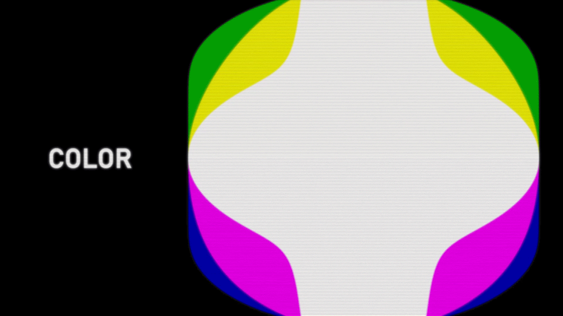
This month, we're going to talk about one of my favorite topics in design. Color! I've been diving deeper into color and color theory lately and I'd like to take a look at a few games and break down their color palettes to see what works, what doesn't work, and tinker with them a little to see if I can find something way different than what the developers intended.
ruiner
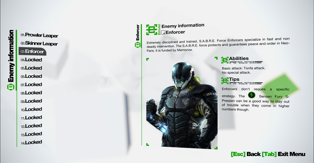
 Ruiner uses a very distinct all red color palette for their UI. The monochrome palette here gives a sense of power and anger with the red. When I first played through Ruiner I thought the red was the brightest read I've ever seen. But now that I'm looking at it, it kind of has a little purple in it. The blue in the background of these screenshots is the particularly blue environment I happen to be standing in. What I find interesting is the developers managed to find a black that isn't difficult to read on the red background. Usually white text goes good with a red background but by using both black and white they are able to create a dynamic visual hierarchy without adding any more colors. Color Explorations
Remember me
 I think Remember Me's color palette is super clean and simple. It looks like they are stark believers in the 60/30/10 rule. The 60/30/10 rule says that your primary color (in this case white) would be used 60% of the time, your secondary color (black here) would be used 30% of the time, and the accent color would be used 10% of the time. This doesn't seem too hard to achieve in Remember Me's case since their background is white and they just have to use black with hints of orange to get the 60/30/10 rule but it's there none-the-less. Remember Me's color palette is very corporate (which is probably what they were going for with the Sensen). The white gives me a sense of purity and cleanliness while the orange shoots a little energy into the otherwise black and white corporation. Color Explorations
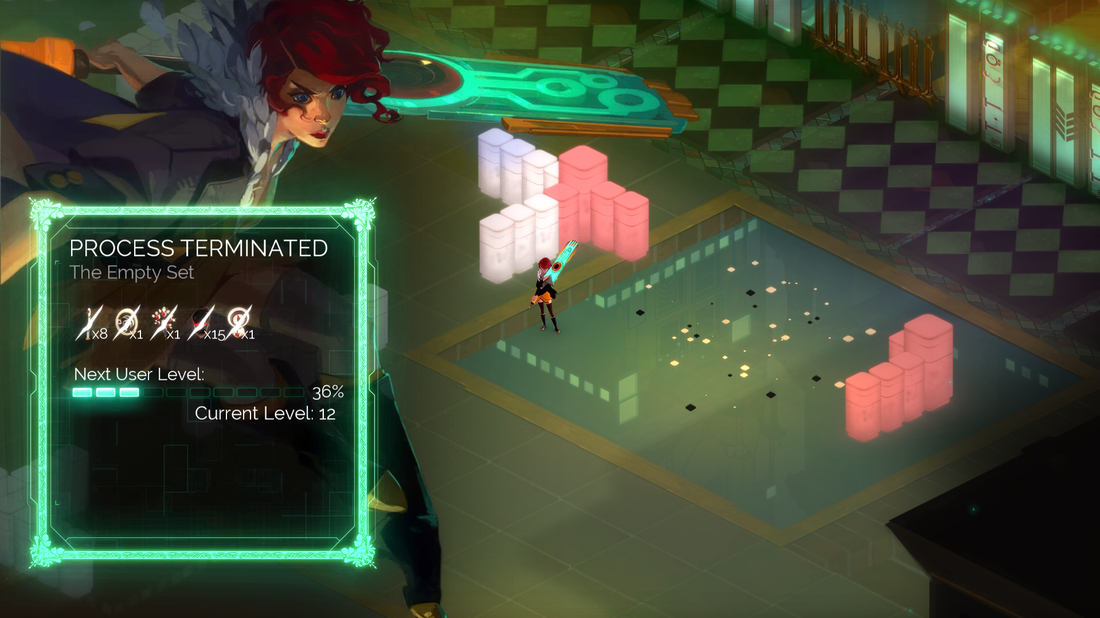
transistor
 Transistor uses a lot of cyan, teal, blue, and green. Occasionally you'll see splashes of yellow or gold like in the Details tab on the left image. This color palette reminds me of the ocean but the art-deco style and outer glow give make it look more like Neon lights. Since green is often used as a relaxing color and blue is often seen as trustworthy, I think the color choice has a calming effect on the game. Like you're going through all this stuff but it's okay. You can trust your sword boyfriend and he will calm you down. Color Explorations
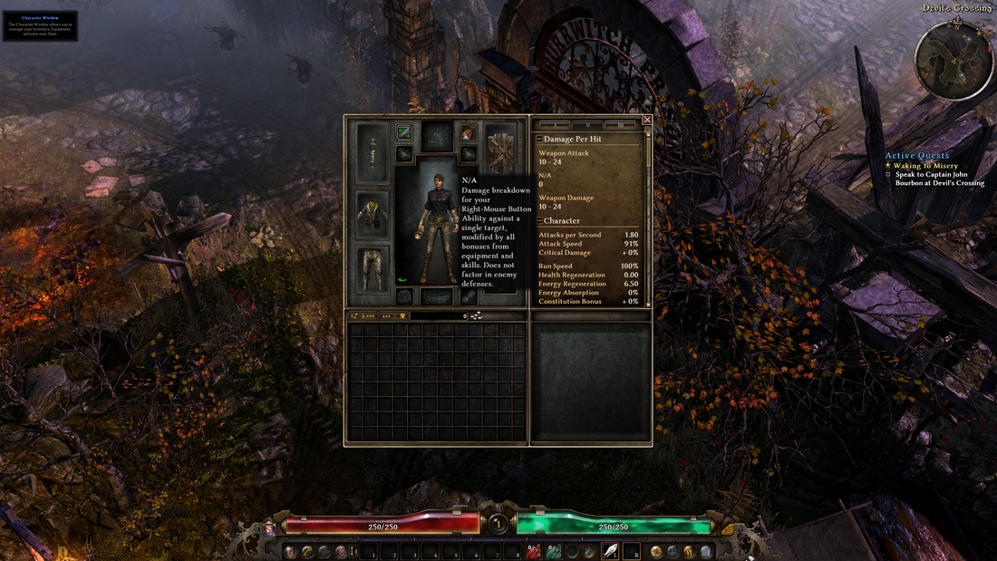
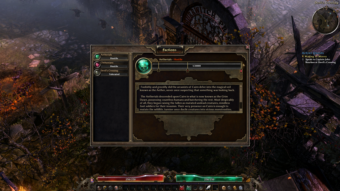
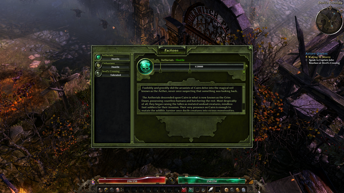
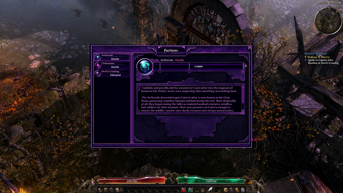
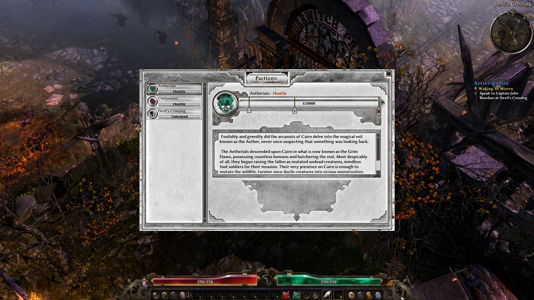
grim dawn
 We've all played a game where the Menus used a color palette like this. Browns, greys, and blacks galore. There's nothing wrong with a brown color palette. It usually tries to root itself in the real-world by texturing visuals to make them look like steel, wood, paper, dirt, leather, and other 'natural' materials. This was the first time I've played Grim Dawn and I picked it because I wanted to see what would happen if we started changing the colors of the menus while the gameplay color palette stayed the same. In the previous explorations we've been looking at full-screen menus but now it's time to look at a modal with the game still running in the background. Color Explorations
Lessons learnedHere are some lessons learned from my color explorations:

Simple LoadingSimple Loading is the most common type of loading in video games. With Simple Loading, there's very few moving parts on the screen. There's often just enough to tell you if the game's frozen but sometimes it doesn't even tell you that. This type of loading uses art and/or gameplay tips to keep you engaged long enough so you won't notice that you've been sitting there for a few minutes now.
Animated LoadingAnimated loading takes simple loading to the next level (literally!). Animated loading screens sacrifice a bit of load time for style. They usually give flavor to the world and keep the player engaged with fancy art. Animated loading screens are not separate from simple loading screens and usually have similar elements. Loading bars, spinners, gameplay tips, lore facts, and stuff like that.
Hidden loadingHidden loading takes a loading screen and twists it a bit so the player might not even know it happened. Sometimes this is done through asynchronous loading while you're walking down a long corridor or riding an elevator. Other times developers like to hide the loading behind cinematics. Either way, the goal of Hidden Loading is to keep the player immersed in the game.
'input' LoadingInput Loading is kind of like hidden loading except while hidden loading tries to keep you immersed, input loading tries to keep you engaged. They're not afraid to take you to a new screen as long as you don't quit the game. Due to a copyright law on "Loading Screen Minigames", there's not a whole lot of loading screens like these on the market. The copyright ended in 2005 so maybe in the future we'll see more input loading screens.
closing thoughtsHere are some key take-aways from this small exploration on Loading Screens:
Also, thank you for voluntarily sitting through loading screens with me! Credits:
1. The Legend of Zelda: Breath of the Wild capture from Krow's Graveyard on YouTube. HERE 2. Resident Evil capture from SHN Survival Horror Network on YouTube. HERE 3. Luigi's Mansion capture from Prosafia Gaming on YouTube. HERE 4. Portal capture from giedmich on YouTube. HERE 5. Rayman Origins capture from OdebGaming on YouTube. HERE 6. Fire Emblem Heroes capture from XCageGame on YouTube. HERE 
example 1: Hearthstone
Hearthstone is well known for feeling like it's a physical thing inside your computer screen. Blizzard has given talks about the UI of Hearthstone (like the one here from GDC). They really wanted to drive home the "immersive UI" feeling by giving everything in the game weight. The transitions between more frequently used screens are meant to give you that sense of immersion. For instance, when you press the Play button or the Open Packs button the Hearthstone board opens up and you zoom inside to do your thing. It doesn't need to do this, the deck selection screen could've just popped up like the quests screen does but Blizzard wanted the game to feel like your opening up a magical box filled with all sorts of cardboard (and metal and wood and lava and cake) adventures. I would say that Hearthstone is a good example of good transitions. Things flow in and out of the screen you understand exactly where you are now and where you have been. Having the board open and close also gives a good sense of how back buttons are supposed to work. Sure some of their more recent additions to the game don't have as much motion polish as the more established features (I'm talking about you Modes Button). But despite that, Hearthstone still maintains it's idea of immersive UI with solid and weighty transitions from one screen to the next. example 2: the legend of Zelda: Ocarina of Time
Image Sources from Nintendo Movie on YouTube. Video link here Ocarina of Time is a classic in my book and I'll take any opportunity I can to talk about it (or play it!). The folks from Nintendo took a unique spin on the start menu. They decided to really drive home the fact that this is their first 3D Zelda game by putting their menu on the inside of a cube! Cycling through the menus will rotate the cube left and right and exiting is done through the controller buttons instead of a button on the menu. Other transitions, like going from outside to inside is just a simple fade or cut. You can still understand what's going on even though it's not a fancy box opening or screen wipe or anything. I bet you didn't even notice that picking up a item and doing the 'I-got-a-new-item' pose zoomed the camera in smoothly but the moment before opening a chest it cuts to the chest turn around. I think the most important transition in Ocarina of Time is the transition from World to Inventory. Having that tiny moment where the menu box collapses in and spins a little helps you understand where you are now compared to where you were. If this menu did a quick cut I bet most people who played the game would be super confused the first few times they pressed the button and might not even explore the other sides of the menu cube. example 3: fable 3
Image Sources from Loopy Longplays on YouTube. Video link here I love the hell out of Fable 3 and the Fable franchise as a whole. However, Fable 3 is often regarded as having one of the worst menus in video games due to the constant loading and travel time between 'submenus'. Doing a simple task like swapping your weapon or checking your gold might take as long as 30 seconds! Although one might call travel time and loading a 'transition', let's take a step back and see how they handle taking you from one place to the next. A lot of Fable's transitions between screens are a cut-to-black and fade-in. This gives you immediate feedback in input while gently placing you where you are now. This does not accomplish the transition goal of easing the player from where they are to where they are going. A better way to transition them from the world to the menu might be to open a portal and have it wave over top the player or something. Inside the menu there's even a portal that you can use to exit the menu! Why not use something like that to give you an idea that you used that portal to enter the menu too. Opening the map is a simple fade too. Although, they did try a little zoom action when looking closer at a town. This could have been another opportunity to pan the camera over the map and zoom in while it's opening. A transition like this might give the map a chance to load too so you don't have textures popping in like they did in the video above. Overall, I guess the transitions in Fable 3 really didn't do it any favors in the Menu department. I originally chose to study this game because I thought the transitions weren't that bad and I hoped they would have been the shining jewel in Fable 3's menu system. But after writing about it I think I convinced myself that the transitions could've been better and they're just another reason why people don't like Fable 3's menu. Closing thoughtsHere are some key take-aways from my quick study on Transitions.
|